Advanced Typography Task 3 / Type Exploration and Application
18.10.2023 - 29.11.2023 / Week 8 - Week 14
Tan Jian Xin / 0350784
Advanced Typography / Bachelor of Design (Hons) in Creative Media
Task 3 / Type Exploration and Application
List / Jump Link
LECTURES
Refer to Task 1 and Task 2.
INSTRUCTIONS
Task 3: Type Exploration and Application
Task 3 proposal
As we are instructed to create a proposal for our final project, I've proposed 2 ideas, one of it is continuing my typeface in semester 1, whereas the second one is to create a movie title.
Description for selected idea
As I've always loved action movies, I've chosen the movie - The Great Wall to develop a typeface.

Figure 1.1: Selected idea (Week 9, 25/10/23)
Ideation / Sketches
I've listed down some characteristics for my typeface such as the props used in the movies (arrows, swords, shields), the great wall (a form of defensive structure, bricks), the monster called tao tie, and the uniform (cape, colors).

Figure 2.1: Ideation / Sketches (Week 9, 25/10/23)
Then, I decided to go with the characteristic of sharp ends as well as a brick-like structure for the typeface as it symbolizes the teeth of the monster (Taotie), the sides of the shield, as well as the weapons used to defeat the monster, and the brick-like structure symbolizes the strong fortification structure - The Great Wall.


Figure 2.2: Characteristics from movie (Week 9, 25/10/23)
Digitalization
I find it a little difficult when I'm constructing the letter 'A', 'O' and 'N' as it has slanting strokes and rounded ends. Therefore, I provided a brick-like structure for the typeface, as shown below.

Figure 3.1: Process / Exploration (Week 9, 28/10/23)
After realizing the misalignments, I changed the height of the rectangles.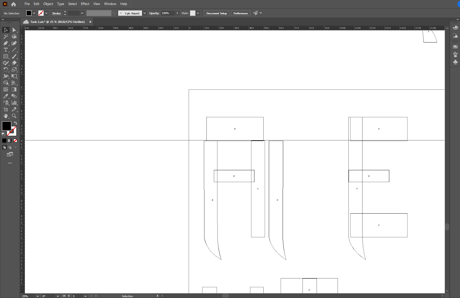
Figure 3.2: Misalignments (Week 9, 28/10/23)
Capital letters

 Figure 3.3: Capital letters (outline-left) (typeface-right) (Week 9, 29/10/23)
After receiving feedbacks from Mr. Vinod, I started to change the height for the vertical strokes and determined the x-height for my typeface.

Figure 3.4: Changing vertical strokes for Capital letters and creating small letters (Week 10, 1/11/23)
Then, I started to create the numerals and my small letters.

Figure 3.5: Process of making small letters and numbers (Week 10, 6/11/23)
After that, I started to import my letters to fontforge following the video uploaded in YouTube. During this week, I felt horrible as I was sick. However, I managed to recover during the weekend to complete the expected outcome for this week.

Figure 3.6: Exporting typeface from Adobe Illustrator (Week 11, 11/11/23)

Figure 3.7: Importing typeface to FontForge (Week 11, 12/11/23)
Then, I did the side bearings and kerning for my typeface shown below. According to Mr. Vinod, capital letters should start with 'H' and 'O', whereas small letters should start with 'n' and 'o'.
Figure 3.8: Kerning and adjusting side bearings (Week 12, 15/11/23)
After that, I generated my typeface, with the font name of brick and installed it on my computer. Then, I created my font presentation on Adobe Illustrator (Ai).

Figure 3.9: Font presentation (Week 12, 19/11/23)
After that, I did my application for my font as shown below in Adobe Illustrator (Ai).

Figure 3.10: Application (Week 12, 19/11/23)
After receiving feedbacks from Mr. Vinod, I then altered the font presentation for the left bottom artboard.
 Figure 3.11: Font presentation alterations (Week 13, 22/11/23)
 Figure 3.12: Font presentation #1 (Week 13, 22/11/23)
 Figure 3.13: Font presentation #2 (Week 13, 22/11/23)

Figure 3.14: Font presentation #3 (Week 13, 22/11/23)

Figure 3.15: Font presentation #4 (Week 13, 22/11/23)
 Figure 3.16: Font presentation #5 (Week 13, 22/11/23)
Mr. Vinod also provided me feedbacks on my application and which I made the changes as shown below. I created the top artboards (grey color scheme) after receiving feedbacks for the artboards below (bright color schemes and movie poster without consistency).
Final
Font preview
Font link: https://drive.google.com/file/d/1GunNYumrEPUbVZdUlLnzJhrnFnHxDat2/view?usp=sharing

Figure 4.6: Application #1 (Week 13, 22/11/23)

Figure 4.7: Application #2 (Week 13, 22/11/23)

Figure 4.8: Application #3 (Week 13, 22/11/23)

Figure 4.9: Application #4 (Week 13, 22/11/23)

Figure 4.10: Application #5 (Week 13, 22/11/23)
FEEDBACKS
Week 14
General feedback: Determine final project based on strengths, not dreams without foundation. Don't forget anything we have learnt in the previous tasks or modules. Carry forward what I have learnt by applying it and improving it. Be ambitious, hungry, and opportunistic, if there's a competition, enter it. Critical thinking is very important. Be current by reading news as we are in the technological sector. Think smart and work smart.
Specific feedback: The spacing between capital letters are not visible.
REFLECTIONS
Experience
Since I'll be utilizing this new typeface in my future work, this exercise was really beneficial. Besides, prior to Task 3, we had to complete the demanding module on Design Research Methodology, which requires a good time management skill, I learnt how to manage my time better. On the other hand, I learnt how to kern capital letters and small letters. For instance, for capital letters, start with 'H' and 'O', while on the other hand, small letters should start with 'n' and 'o' while kerning. Then, compare it with other letters and kern accordingly.
Observations
I was reminded of the things I learnt in task 1 and task 2 such as the consistency in visuals and the interplay of the image and the typeface. Therefore, I am very grateful for this task to help me refresh what I have learnt in Advanced Typography. Besides, I learnt how to observe the works of my friends and thought of ways on how to improve them.
Findings
I found that the letters with slanted strokes such as 'Z', 'X', and 'K' are quite hard to make compared to vertical and horizontal strokes such as 'T', 'E', and 'L'. I was also a little worried that my font would not come out well as I was sick in week 11. However, I managed to recover and keep up with the progress of other students as Mr. Vinod stated the expectations for each week, which I felt very thankful for. Therefore, I managed to complete week 12's expectation after my recovery.
FURTHER READINGS
I've revised on how to design the punctuations such as comma and period. The period should be large enough to indicate a pause in the text. However, it should not disrupt the reading flow of the readers.

Figure 5.1: Punctuation (period)
INSTRUCTIONS
Task 3: Type Exploration and Application
Task 3 proposal
As we are instructed to create a proposal for our final project, I've proposed 2 ideas, one of it is continuing my typeface in semester 1, whereas the second one is to create a movie title.
Description for selected idea
As I've always loved action movies, I've chosen the movie - The Great Wall to develop a typeface.
Figure 1.1: Selected idea (Week 9, 25/10/23)
Ideation / Sketches
I've listed down some characteristics for my typeface such as the props used in the movies (arrows, swords, shields), the great wall (a form of defensive structure, bricks), the monster called tao tie, and the uniform (cape, colors).
Figure 2.1: Ideation / Sketches (Week 9, 25/10/23)
Then, I decided to go with the characteristic of sharp ends as well as a brick-like structure for the typeface as it symbolizes the teeth of the monster (Taotie), the sides of the shield, as well as the weapons used to defeat the monster, and the brick-like structure symbolizes the strong fortification structure - The Great Wall.
Figure 2.2: Characteristics from movie (Week 9, 25/10/23)
Digitalization
I find it a little difficult when I'm constructing the letter 'A', 'O' and 'N' as it has slanting strokes and rounded ends. Therefore, I provided a brick-like structure for the typeface, as shown below.
Figure 3.1: Process / Exploration (Week 9, 28/10/23)
After realizing the misalignments, I changed the height of the rectangles.
Figure 3.2: Misalignments (Week 9, 28/10/23)
Capital letters
Figure 3.4: Changing vertical strokes for Capital letters and creating small letters (Week 10, 1/11/23)
Then, I started to create the numerals and my small letters.
Figure 3.5: Process of making small letters and numbers (Week 10, 6/11/23)
After that, I started to import my letters to fontforge following the video uploaded in YouTube. During this week, I felt horrible as I was sick. However, I managed to recover during the weekend to complete the expected outcome for this week.
Figure 3.6: Exporting typeface from Adobe Illustrator (Week 11, 11/11/23)
Figure 3.7: Importing typeface to FontForge (Week 11, 12/11/23)
Then, I did the side bearings and kerning for my typeface shown below. According to Mr. Vinod, capital letters should start with 'H' and 'O', whereas small letters should start with 'n' and 'o'.
Figure 3.8: Kerning and adjusting side bearings (Week 12, 15/11/23)
After that, I generated my typeface, with the font name of brick and installed it on my computer. Then, I created my font presentation on Adobe Illustrator (Ai).
Figure 3.9: Font presentation (Week 12, 19/11/23)
After that, I did my application for my font as shown below in Adobe Illustrator (Ai).
Figure 3.10: Application (Week 12, 19/11/23)
After receiving feedbacks from Mr. Vinod, I then altered the font presentation for the left bottom artboard.


Figure 3.14: Font presentation #3 (Week 13, 22/11/23)

Figure 3.15: Font presentation #4 (Week 13, 22/11/23)

Figure 3.17: Application alterations (Week 13, 22/11/23)
Figure 3.18: Application #1 (Week 13, 22/11/23)
Figure 3.19: Application #2 (Week 13, 22/11/23)
Figure 3.20: Application #3 (Week 13, 22/11/23)
Figure 3.21: Application #4 (Week 13, 22/11/23)
Figure 3.22: Application #5 (Week 13, 22/11/23)

Figure 3.18: Application #1 (Week 13, 22/11/23)

Figure 3.19: Application #2 (Week 13, 22/11/23)

Figure 3.20: Application #3 (Week 13, 22/11/23)

Figure 3.21: Application #4 (Week 13, 22/11/23)

Figure 3.22: Application #5 (Week 13, 22/11/23)
Final
Font preview
Figure 4.1: Font presentation #1 (Week 13, 22/11/23)
Figure 4.2: Font presentation #2 (Week 13, 22/11/23)
Figure 4.3: Font presentation #3 (Week 13, 22/11/23)
Figure 4.4: Font presentation #4 (Week 13, 22/11/23)
Figure 4.5: Font presentation #5 (Week 13, 22/11/23)
Figure 4.6: Application #1 (Week 13, 22/11/23)
Figure 4.7: Application #2 (Week 13, 22/11/23)
Figure 4.8: Application #3 (Week 13, 22/11/23)
Figure 4.9: Application #4 (Week 13, 22/11/23)
Figure 4.10: Application #5 (Week 13, 22/11/23)
FEEDBACKS
Week 14
General feedback: Determine final project based on strengths, not dreams without foundation. Don't forget anything we have learnt in the previous tasks or modules. Carry forward what I have learnt by applying it and improving it. Be ambitious, hungry, and opportunistic, if there's a competition, enter it. Critical thinking is very important. Be current by reading news as we are in the technological sector. Think smart and work smart.
Specific feedback: The spacing between capital letters are not visible.
Week 13
Specific feedback: The first and second artboards are somewhat okay, whereas the bottom ones is not really okay as there are white spaces around the artboards. If it is black and white, try to make it off white and add it in the background. The poster should have some interplay with the image. Think of making the visuals consistent and make the typeface stand out more than the visuals.
Week 12
Specific feedback: Follow the guidelines provided in Microsoft Teams.
Week 11
General feedback: MC
Week 10
General feedback: Place uppercase and lowercase next to each other when creating typeface.
Specific feedback: Put uppercase next to lowercase when developing. Determine x-height and place grids behind to maintain consistency. Try to keep the 'horns' above baseline.
Week 9
General feedback: Don't delete or remove the progress of fonts, record everything. When deciding on a topic, we should state what we are doing and why we are doing. In addition to baselines, ascender lines, descender lines, create grid lines behind fonts to create consistency.
Specific feedback: Proceed with development for the movie "The Great Wall".
Week 8
Specific feedback: Don't provide purpose of font, just say whiteboard marker font. Find existing movies to have comparison.
REFLECTIONS
Experience
Since I'll be utilizing this new typeface in my future work, this exercise was really beneficial. Besides, prior to Task 3, we had to complete the demanding module on Design Research Methodology, which requires a good time management skill, I learnt how to manage my time better. On the other hand, I learnt how to kern capital letters and small letters. For instance, for capital letters, start with 'H' and 'O', while on the other hand, small letters should start with 'n' and 'o' while kerning. Then, compare it with other letters and kern accordingly.
Observations
I was reminded of the things I learnt in task 1 and task 2 such as the consistency in visuals and the interplay of the image and the typeface. Therefore, I am very grateful for this task to help me refresh what I have learnt in Advanced Typography. Besides, I learnt how to observe the works of my friends and thought of ways on how to improve them.
Findings
I found that the letters with slanted strokes such as 'Z', 'X', and 'K' are quite hard to make compared to vertical and horizontal strokes such as 'T', 'E', and 'L'. I was also a little worried that my font would not come out well as I was sick in week 11. However, I managed to recover and keep up with the progress of other students as Mr. Vinod stated the expectations for each week, which I felt very thankful for. Therefore, I managed to complete week 12's expectation after my recovery.
FURTHER READINGS
I've revised on how to design the punctuations such as comma and period. The period should be large enough to indicate a pause in the text. However, it should not disrupt the reading flow of the readers.
Figure 5.1: Punctuation (period)
Besides, the shape of the period should relate to the dot on the i, but slightly larger. As my font is heavier, it should have heavier punctuations compared to regular fonts.

Figure 5.2: Shape of period
Moreover, I noticed that there are various stylistic options for the exclamation point as shown below.
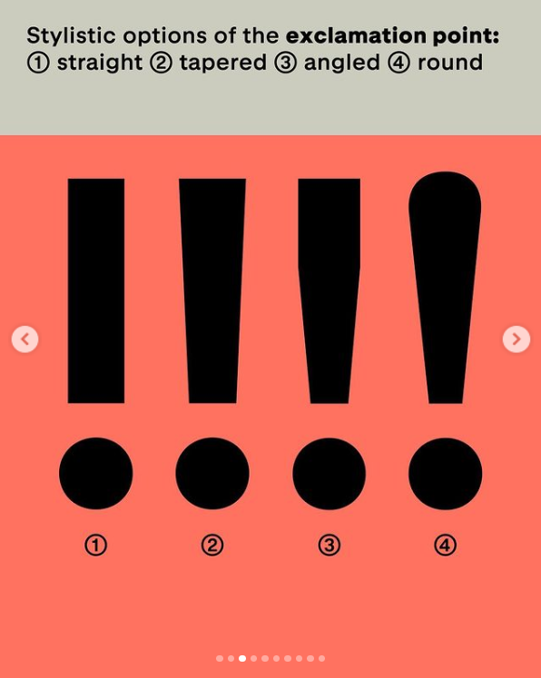
Figure 5.2: Shape of period
Moreover, I noticed that there are various stylistic options for the exclamation point as shown below.
Figure 5.3: Exclamation point


Comments
Post a Comment