Design Principles Task 1 / Exploration
6.2.2024 - 20.2.2024 / Week 1 - Week 3
Tan Jian Xin / 0350784
Design Principles / Bachelor of Design (Hons) in Creative Media
Task 1 / Exploration
List / Jump Link
LECTURES
Elements of Design - Individual "building blocks"
- Point
- Simplest element of design
- Repetitive mark forms a line
- Other 2/3D figures and forms are created as the point moves in spaceFigure 1.1: Point
- Line
- Can be active or static / aggressive or passive / sensual or mechanical
- Can indicate direction, define boundaries of shapes and spaces, imply volumes and suggest motion or emotion
- Can be grouped to depict qualities of light and shadow and to form patterns and texturesFigure 1.2: Line
- Shape
- Expanse within the outline
- Becomes visible when a line enclose an area or change in value (light/dark) or texture
- General category of shapes - Geometric (Tend to be precise and regular) & Organic (Irregular, more informal than geometric)
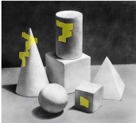
Figure 1.3: Shape - Form
- 2D - shape, 3D - form
- Volume - Form encloses space
- Major element in sculpture and architecture
- 2D media such as painting, drawing, or illustration, form must be impliedFigure 1.4: Example of 2D media
- Texture
- Tactile qualities of surfaces
- Categories of texture - Actual (experienced by touch) & Simulated or Implied (created to look like the real texture)
Figure 1.5: Textures examples - Space
- Indefinable, general receptacle of all things - seemingly empty space around us
- Drawings, prints, paintings, photographs, space of surface is seen all at once
- Actual space of each picture is defined by the 2 dimensions (height & width)
- 3D space is experienced from our own positions in relation to other people, objects surfaces and voids at various distances from ourselves
- From outside, we experience mass whereas from the inside, we experience volume
- In graphic design, space refers to area that a shape or form occupies. Can be defined as positive (filled space) or negative (empty space)
- Illusion of 3D space can be suggested through depth. For instance, overlapping images, variation of sizes, placement and perspective
Figure 1.6: 3D spaces from outside and inside - Color
- Visual byproduct of the spectrum of light. It is the light wavelengths that the human eye receives
- Hue - Colors of spectrum
- Eg: yellow, green, red,...
- Value - Lightness or darkness from white through greys to black
- White added to hue produces a tint
- Grey added to hue results in a tone
- Black added to hue produces a shade of hue
Figure 1.7: Value - Intensity - Saturation/chroma, refers to purity of a hue
- Pure hue is most intense form, highest saturation, in its brightest form
- With pigment (black, white or grey) of another hue is added to a pure hue, its intensity diminishes and is dulled
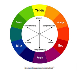
Figure 1.8: Intensity - Color schemes - color groupings that provide distinct color harmonies
- Monochromatic color schemes are based on variations in value and intensity of a single hue
- Analogous color schemes are based on colors adjacent to one another on the color wheel, each containing the same pure hue
- Complementary color schemes emphasize two hues directly opposite each other on the color wheel
Figure 1.9: Color schemes
Figure 1.10: Monochrome, Complementary, Analogous (left to right)


Principles of Design - Organizational fundamentals that resulted from or guides the arrangement of the elements
 Figure 1.21: Examples of symmetrical balance
 Figure 1.22: Examples of asymmetrical balance

Figure 1.34: Representations of symbols
1. Pictorial symbols
- Image-related and simplified pictures
- Useful for educational materials - enable learner to see the object of study in an almost real visual form
Figure 1.35: Examples of pictorial symbols
2. Abstract symbols
- Can look like the objects but have less details

Figure 1.36: Examples of abstract symbols
3. Arbitrary symbols
- No resemblance at all to the objects or ideas
- Invented with meaning constructed (based on geometric shapes/colors)
Figure 1.37: Examples of arbitrary symbols
Word & Image
- Use suitable and relevant images when designing
- Choose right words to pair with the imagery to deepen the meaning of design (suitable typeface and strategic positioning results in visual hierarchy and balance)

Figure 1.38: Examples of application of word & image
INSTRUCTIONS
Module Information Booklet (MIB)
SDG 14 - LIFE BELOW WATER
The 14th goal set by the United Nations is Life Below Water. This goal aims to conserve and sustainably use the oceans, seas, and marine resources for sustainable development. As oceans cover more than 70% of the Earth's surface, it is vital for maintaining biodiversity, managing climate change, supplying food and livelihoods, and enabling international trade and transportation. However, the destruction of habitat, overfishing, pollution, climate change, and other human activities poses a serious threat to marine ecosystems and resources. Therefore, it intends to enhance the health and resilience of marine ecosystems, safeguarding the well-being of coastal communities. The reason I chose this goal is because water plays a huge role even in our daily life. For instance, keeping us hydrated, clean and sanitized, food preparation, and many more. Oceans not only play a critical role in regulating the Earth's climate by absorbing heat and providing oxygen but it also supports the marine ecosystems in many economic activities such as fishing, tourism, and shipping. Therefore, aside from reducing poverty and promoting sustainable development, protecting marine ecosystems could also open up economic prospects for coastal communities.
 Figure 2.1: Mind map information from Condor Ferries

I believe that the message is conveyed effectively through the artwork as the illustration aims to evoke an emotional response from the viewer. The design principles I have observed in the illustration above are emphasis, movement, hierarchy, repetition of lines which results in a flowing rhythm, proportion and scale, harmony and unity. To illustrate, the entangled dolphin draws the attention of the viewer and it acts as a focal point to emphasize the danger of overfishing as well as plastic pollution faced by marine inhabitants. Besides, the threat to the environment is highlighted as a more dominant element compared to the lady in blue which creates hierarchy to the artwork. The spiral element (hair of the lady-repetition of wavy lines) envelops the storm (destroyed habitats) within the calm waves, providing movement to the illustration. The scale and proportion of the large lady and the small man is applied alongside perspective to provide more depth to the illustration. Furthermore, the use of light green and blue gradients representing the polluted ocean creates harmony and unity to emphasize the need to reduce plastic pollution and overfishing to save the lives below water.
FEEDBACKS
Week 3
Enlarge the image of the illustration so that the viewers could look at the details in it. Reduce the amount of background information. Explain more on artist intentions (will naturally use design principles) by using a more narrative explanation. Provide links for own research.
- Contrast
- Juxtaposition of strongly dissimilar elements such as different color, size, shape, texture to highlight key elements and create visual interest
- Balance
- Distribute visual elements evenly to create a sense of equilibrium within design
- Types of balance: symmetrical, asymmetrical, radial, mosaic, discordant
- Emphasis
- Make elements stand out by drawing attention and guide viewer's focus toward specific areas or actions
- Can be achieved through placement, contrast, color, size, repetition
- Relates to focal point
- Rules of Third
- Composition guideline that places subject on the left or right third of an image
- Generally leads to compelling and well-composed designs
- Repetition/Pattern/Rhythm
- A regular arrangement of alternated or repeated elements (shape, color, line) or motifs
- 5 kinds of rhythm: random, regular, alternating, progressive, and flowing
- Repetition of elements in regular or cyclic fashion creates interest
- Movement
- Use of recurring elements to direct the movement of the eye through artwork
- Can be directed along edges and by means of shape and color
- Hierarchy
- Organize content and elements that guides viewer's attention by emphasizing the most important information first
- Alignment
- Arranging elements along a common axis or edge to create a sense of order
- Harmony & Unity
- The arrangement of elements to give the viewer the feeling that all the parts of the piece form a coherent whole
- Gestalt Theory
- How human brain is wired to see patterns, logic, structure and how human eye perceives visual elements
- Aim to show how eyes perceive complex scenes to simple shapes as a single, united form than the separate simpler elements
- Symbol
- Creation of meaningful and effective icons or symbols that convey messages
- Can be achieved through clarity, simplicity, distinctiveness, relevance, consistency, scalability, adaptability
- Word and Image
- Good textual and visual content combination to convey ideas, thoughts, or messages
- Can be achieved through alignment, contrast, balance, whitespace, hierarchy, complementarity
Contrast and Gestalt Theory
Contrast
- Juxtaposition of strongly dissimilar elements
- Provide visual interest, emphasize a point and express content
 Figure 1.11: Examples of contrast in architecture, book covers, posters, and photograph
- "Gestalt" refers to "shape" or "form" in German
- How human brain is wired to see patterns, logic, structure and how human eye perceives visual elements
- Aim to show how eyes perceive complex scenes to simple shapes as a single, united form than the separate simpler elements
Contrast
- Juxtaposition of strongly dissimilar elements
- Provide visual interest, emphasize a point and express content
Gestalt Theory
- How human brain is wired to see patterns, logic, structure and how human eye perceives visual elements
- Aim to show how eyes perceive complex scenes to simple shapes as a single, united form than the separate simpler elements
- Principle of similarity
- Similar elements in a design as a complete picture, shape, or group, even if those elements are separated
- The brain links the elements of a similar nature
Figure 1.12: Examples - Principle of continuation
- Human eye follows paths, lines, and curves of a design, a continuous flow of visual elements is preferred
Figure 1.13: Examples - Principle of closure
- Prefers to see complete shapes. If the visual elements are not complete, user can perceive a complete shape by filling in missing visual information
Figure 1.14: Examples - Principle of proximity
- Ensuring related design elements are placed together, unrelated items should be spaced apart
- Close proximity indicates items are connected or have a relationship to each other
Figure 1.15: Website design - Principle of figure/ground
- Objects stand out by being in the foreground or the background
Figure 1.16: Examples - Law of symmetry & order
- Elements that are symmetrical to each other tend to be perceived as a unified group
- Objects that are symmetrical with each other will be more likely to be grouped together
Figure 1.17: Examples


I did some further reading on gestalt principles of design after watching the recorded lecture videos on Youtube.
7. Law of uniform connectedness- Visually-connected objects are more related than objects with no connection
Figure 1.18: Example

- Prägnanz is a German term meaning "good figure"
- People will perceive and interpret ambiguous or complex images in the simples form possibleFigure 1.19: Example

- Objects that move in the same direction seem more related than elements that are stationary or move in different directions
Figure 1.20: Example

Balance and Emphasis
Balance
Balance
- Distribution of visual weight in a work of design
- Visual equilibrium of the elements that causes the image to appear balanced
- Can be symmetrical or asymmetrical
- Visual equilibrium of the elements that causes the image to appear balanced
- Can be symmetrical or asymmetrical
1. Symmetrical balance
- Has equal "weight" on equal sides of a centrally placed fulcrum
- Bilateral balance - equal arrangement of elements on either side of the central axis (horizontal/vertical)
- Has equal "weight" on equal sides of a centrally placed fulcrum
- Bilateral balance - equal arrangement of elements on either side of the central axis (horizontal/vertical)
- Radial balance - arranging elements equally around a central point
- Approximate symmetry - equivalent but not identical forms are arranged around the fulcrum line
- Approximate symmetry - equivalent but not identical forms are arranged around the fulcrum line
2. Asymmetrical balance
- Unequal visual weight on each side of the composition
- One side of composition might contain a dominant element, which could be balanced by a couple or more lesser focal points on the other side
- More dynamic and interesting. Evokes feelings of modernism, movement, energy and vitality
- Offers more visual variety, although it is more difficult to achieve as the relationships between elements are more complex.
3. The golden ratio
- Mathematical concept known as phi, golden mean, golden section (representative of perfect beauty)
- Guide to create visual balance in architecture and paintings
- Can be used to bring harmony, balance, and structure to one's work which results in the increase of the appeal of a design work

 Figure 1.23: Examples of golden ratio

Figure 1.24: Examples of rule of thirds
5. Emphasis and dominance
- Emphasis is used to create dominance and focus in a design work
- Various elements can be used to create emphasis, such as color, shape or value, to achieve dominance

Figure 1.25: Examples of emphasis and dominance
- Mathematical concept known as phi, golden mean, golden section (representative of perfect beauty)
- Guide to create visual balance in architecture and paintings
- Can be used to bring harmony, balance, and structure to one's work which results in the increase of the appeal of a design work
4. Rule of thirds
- Composition guideline to create more dynamism to a work of design/photography/film/painting
- Image is divided evenly into thirds, both horizontally and vertically, subject is placed at the intersection of dividing lines, or along one of the lines itself.
- Composition guideline to create more dynamism to a work of design/photography/film/painting
- Image is divided evenly into thirds, both horizontally and vertically, subject is placed at the intersection of dividing lines, or along one of the lines itself.
Figure 1.24: Examples of rule of thirds
5. Emphasis and dominance
- Emphasis is used to create dominance and focus in a design work
- Various elements can be used to create emphasis, such as color, shape or value, to achieve dominance
Figure 1.25: Examples of emphasis and dominance
Repetition and Movement
Repetition
- Creates rhythm and pattern to make a work of design seem active
- Variety is crucial to avoid monotony (Ex: varying angles, exposure, composition, etc.)
- Pattern increases visual excitement

Figure 1.26: Examples of repetitive patterns
Movement
- The way the design leads the path the eye follows
- Objects seem to be moving in a visual image
- Comes in shapes, forms, lines, and curves
Figure 1.27: Examples of movement
Hierarchy
- Choreography of content in a composition
- Direct viewers to the most important information first, then navigates through secondary content

Figure 1.28: Example of hierarchy
Alignment
- Placement of elements that edges line up along common rows, or their bodies along a common center
- Creates a sense of unity and cohesion by leading a person through a design

Figure 1.29: Example of alignment
Harmony and Unity
Harmony
- Selection of elements that share a common trait
- Sense that all of the elements of design fit together (same theme, aesthetic style, or mood)

Figure 1.30: Example of harmony
Unity
- Repetition of particular elements (colors, shapes, materials)
- A sense of oneness/balanced, creating a theme
- Different from harmony

Figure 1.31: Example of unity
Scale and proportion
Scale
- Size of one object in relation to the other objects
- Can be determined: actual measurement (Architectural drawing) / visual estimates based on comparison
Figure 1.32: Examples of scale
Proportion
- Size of the parts of an object in relationship to other parts of the same object (2 or more elements in respect to size, color, quantity, degree, setting, ratio)
- Effective use of proportion often results in harmony and unity


Figure 1.33: Example of proportion
Symbol, Word & Image
Symbols
- A sign, shape, or object to represent something else
- In design, symbols convey information
Repetition
- Creates rhythm and pattern to make a work of design seem active
- Variety is crucial to avoid monotony (Ex: varying angles, exposure, composition, etc.)
- Pattern increases visual excitement
Figure 1.26: Examples of repetitive patterns
Movement
- The way the design leads the path the eye follows
- Objects seem to be moving in a visual image
- Comes in shapes, forms, lines, and curves
Figure 1.27: Examples of movement
Hierarchy
- Choreography of content in a composition
- Direct viewers to the most important information first, then navigates through secondary content
Figure 1.28: Example of hierarchy
Alignment
- Placement of elements that edges line up along common rows, or their bodies along a common center
- Creates a sense of unity and cohesion by leading a person through a design
Figure 1.29: Example of alignment
Harmony and Unity
Harmony
- Selection of elements that share a common trait
- Sense that all of the elements of design fit together (same theme, aesthetic style, or mood)
Figure 1.30: Example of harmony
Unity
- Repetition of particular elements (colors, shapes, materials)
- A sense of oneness/balanced, creating a theme
- Different from harmony
Figure 1.31: Example of unity
Scale and proportion
Scale
- Size of one object in relation to the other objects
- Can be determined: actual measurement (Architectural drawing) / visual estimates based on comparison
Figure 1.32: Examples of scale
Proportion
- Size of the parts of an object in relationship to other parts of the same object (2 or more elements in respect to size, color, quantity, degree, setting, ratio)
- Effective use of proportion often results in harmony and unity
Figure 1.33: Example of proportion
Symbol, Word & Image
Symbols
- A sign, shape, or object to represent something else
- In design, symbols convey information
Figure 1.34: Representations of symbols
1. Pictorial symbols
- Image-related and simplified pictures
- Useful for educational materials - enable learner to see the object of study in an almost real visual form
Figure 1.35: Examples of pictorial symbols
2. Abstract symbols
- Can look like the objects but have less details
Figure 1.36: Examples of abstract symbols
3. Arbitrary symbols
- No resemblance at all to the objects or ideas
- Invented with meaning constructed (based on geometric shapes/colors)
Figure 1.37: Examples of arbitrary symbols
Word & Image
- Use suitable and relevant images when designing
- Choose right words to pair with the imagery to deepen the meaning of design (suitable typeface and strategic positioning results in visual hierarchy and balance)
Figure 1.38: Examples of application of word & image
INSTRUCTIONS
Module Information Booklet (MIB)
We are instructed to pick and briefly describe 1 goal from UNSDG. Then, select and existing art/design work that revolves around the goal we have chosen and explain why we chose the design in relation to the UNSDG goal and list the design principles we observed in the design.
The 14th goal set by the United Nations is Life Below Water. This goal aims to conserve and sustainably use the oceans, seas, and marine resources for sustainable development. As oceans cover more than 70% of the Earth's surface, it is vital for maintaining biodiversity, managing climate change, supplying food and livelihoods, and enabling international trade and transportation. However, the destruction of habitat, overfishing, pollution, climate change, and other human activities poses a serious threat to marine ecosystems and resources. Therefore, it intends to enhance the health and resilience of marine ecosystems, safeguarding the well-being of coastal communities. The reason I chose this goal is because water plays a huge role even in our daily life. For instance, keeping us hydrated, clean and sanitized, food preparation, and many more. Oceans not only play a critical role in regulating the Earth's climate by absorbing heat and providing oxygen but it also supports the marine ecosystems in many economic activities such as fishing, tourism, and shipping. Therefore, aside from reducing poverty and promoting sustainable development, protecting marine ecosystems could also open up economic prospects for coastal communities.
1st Illustration
The illustration below is created by Tanya Protasova to draw attention to the issue of plastic pollution in the water and how it impacts both humans and marine life. I chose this artwork in relation to the SDG 14 goal as it draws attention to the threats faced by marine inhabitants, particularly plastic pollution. Additionally, it also encourages the public to safeguard the ocean by reducing plastic consumption, recycling responsibly, and encouraging the usage of biodegradable materials. Figure 2.2: Plastic Ocean by Tanya Protasova on April 25th 2022
I believe that the message is conveyed effectively through the artwork as the illustration aims to evoke an emotional response from the viewer. The design principles I have observed in the illustration above are emphasis, movement, hierarchy, repetition of lines which results in a flowing rhythm, proportion and scale, harmony and unity. To illustrate, the entangled dolphin draws the attention of the viewer and it acts as a focal point to emphasize the danger of overfishing as well as plastic pollution faced by marine inhabitants. Besides, the threat to the environment is highlighted as a more dominant element compared to the lady in blue which creates hierarchy to the artwork. The spiral element (hair of the lady-repetition of wavy lines) envelops the storm (destroyed habitats) within the calm waves, providing movement to the illustration. The scale and proportion of the large lady and the small man is applied alongside perspective to provide more depth to the illustration. Furthermore, the use of light green and blue gradients representing the polluted ocean creates harmony and unity to emphasize the need to reduce plastic pollution and overfishing to save the lives below water.
2nd Illustration
Elena Zinovieva created the illustration below to highlight the issue of plastic pollution as well as the consequences it has on humans. I chose this as my second artwork as it raises public awareness on the challenges faced by marine inhabitants and motivates people to protect the ocean by promoting the use of biodegradable products.

In my opinion, I think the artwork above is simple and nice as it communicates the idea of the increase in plastic waste in our ocean and it makes the viewer feel that something needs to be done to save the Earth. The design principles I have observed in the illustration above are emphasis, symmetrical balance, hierarchy, alignment, word and image, repetition. This can be seen as the water bottle is placed in the middle to emphasize what we are drinking everyday. Besides, the plastic waste inside shows that we are ultimately harming our own health as we drink what we throw into the ocean (contaminants) as the word on the label says “Water from natural sources”. There is hierarchy as well as central alignment as the bottle is placed symmetrically on the artboard. Other than that, there are repetition of small circles inside the water bottle to illustrate the bubbles in the ocean.
FEEDBACKS
Week 3
Enlarge the image of the illustration so that the viewers could look at the details in it. Reduce the amount of background information. Explain more on artist intentions (will naturally use design principles) by using a more narrative explanation. Provide links for own research.


Comments
Post a Comment