Advanced Typography Task 1 / Exercises
30.8.2023 - 20.9.2023 / Week 1 - Week 4
Tan Jian Xin / 0350784
Advanced Typography / Bachelor of Design (Hons) in Creative Media
Task 1 / Exercise 1 & 2
List / Jump Link
LECTURES
Week 1: Typographic Systems
8 major variations
- Axial
- Radial
- Dilational
- Random
- Grid
- Modular
- Transitional
- Bilateral
1. Axial system - All elements are organised to the left or right of a single axis
Figure 1.1: Axial system
2. Radial system - All elements are extended from a point of focus
Figure 1.2: Radial system
3. Dilational system - All elements expand from a central point in a circular fashion
Figure 1.3: Dilational system
4. Random system - Elements appear to have no specific pattern or relationship
Figure 1.4: Random system
5. Grid system - A system of vertical and horizontal divisions
Figure 1.5: Grid system
6. Transitional system - An informal system of layered banding
Figure 1.6: Transitional system
7. Modular system - A series of non-objective elements that are constructed in as a standardized units
Figure 1.7: Modular system
8. Bilateral system - All text is arranged symmetrically on a single axis
Figure 1.8: Bilateral systemWeek 2: Typographic Composition
Rule of thirds: A photographic guide to composition. Intersecting lines are used as focal point of layout. No one would use this rule when there are other more favorable options.
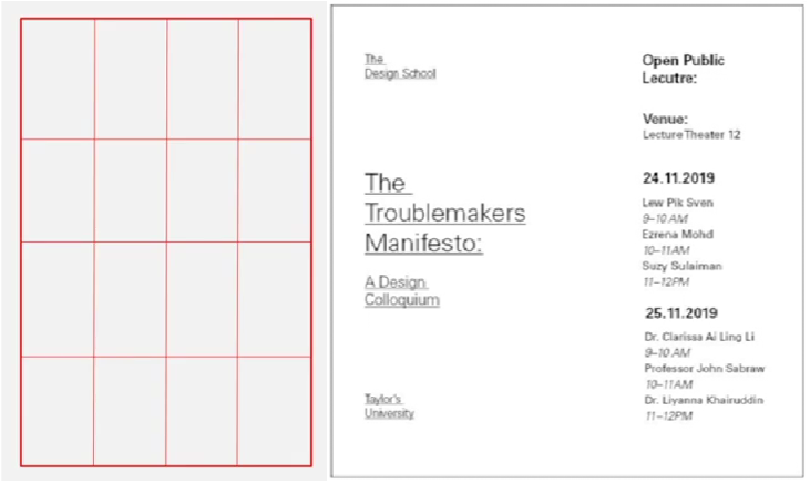
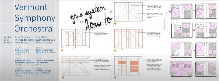
Grid system
Environmental Grid: Exploration of an existing structure or numerous structures combined
Form and movement: Exploration of an existing Grid System. To see turning of pages in a book as a slowed-down animation in the form that constitutes the placement of image, text and color.
Week 3: Context and Creativity
Handwriting in the early stage
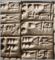
Cuneiform - Earliest system of actual writing (c. 3000 B.C.E.)
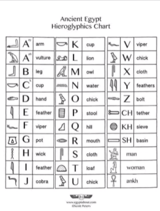
Hieroglyphics - Egyptian writing system fused with art of relief carving (2613-2160 B.C.E.)
Early Greek / 5th C. B.C.E - Egyptian logo-consonantal system, 22 phonetic alphabet letters. Reading direction not fixed. Drew freehand.
Roman Uncials - Become more rounded to be written faster
English Half Uncials, 8th C. - More slanted and condensed form
Carolingian Minuscule - Basis of lowercase Roman type. Capitals at start of sentence, spaces between words and punctuation
Oldest writing found in 'Indian' subcontinent - undeciphered
Brahmi script - Earliest writing system developed in India after Indus script (450-350 BCE)
Southeast Asia scripts
Baloo (by Ek Type) - A perfect blend of pointy paws in a coat of fur. An affable display typeface. A multi-script typeface, available in nine Indian scripts.
Week 4: Designing Type
Reasons for designing another typeface:
- Improve legibility
- A form of artistic expression
Adrian Frutiger
- Renowned twentieth century Swiss graphic designer
- Valued contribution to typography: Univers and Frutiger
- Purpose of Frutiger is to create a clean, distinctive and legible typeface that is easy to see from both close up and far away.
Figure 1.27: Comparison of font vs printed
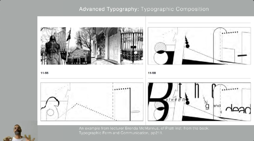
Principles of Design Composition: Emphasis, isolation, repetition, balance (symmetry and asymmetry), alignment, perspective, contrast.
Rule of thirds: A photographic guide to composition. Intersecting lines are used as focal point of layout. No one would use this rule when there are other more favorable options.
Grid system
Environmental Grid: Exploration of an existing structure or numerous structures combined
Form and movement: Exploration of an existing Grid System. To see turning of pages in a book as a slowed-down animation in the form that constitutes the placement of image, text and color.
Week 3: Context and Creativity
Handwriting in the early stage
Cuneiform - Earliest system of actual writing (c. 3000 B.C.E.)
Hieroglyphics - Egyptian writing system fused with art of relief carving (2613-2160 B.C.E.)
Early Greek / 5th C. B.C.E - Egyptian logo-consonantal system, 22 phonetic alphabet letters. Reading direction not fixed. Drew freehand.
Roman Uncials - Become more rounded to be written faster
English Half Uncials, 8th C. - More slanted and condensed form
Carolingian Minuscule - Basis of lowercase Roman type. Capitals at start of sentence, spaces between words and punctuation
Oldest writing found in 'Indian' subcontinent - undeciphered
Brahmi script - Earliest writing system developed in India after Indus script (450-350 BCE)
Southeast Asia scripts
Week 4: Designing Type
Reasons for designing another typeface:
- Improve legibility
- A form of artistic expression
Adrian Frutiger
- Renowned twentieth century Swiss graphic designer
- Valued contribution to typography: Univers and Frutiger
- Purpose of Frutiger is to create a clean, distinctive and legible typeface that is easy to see from both close up and far away.
Figure 1.25: Frutiger typeface
Figure 1.26: VerdanaMatthew Carter
- Royal Designer for Industry, contemporary British type designer and ultimate craftsman
- Fonts created: Verdana (designed using pixels), Bell Centennial
- Royal Designer for Industry, contemporary British type designer and ultimate craftsman
- Fonts created: Verdana (designed using pixels), Bell Centennial
Bell Centennial, designed to solve blurriness while printing in the telephone directories.
Edward Johnston
- Created Underground typeface
General process of type design
1. Research
Typeface Construction
Construction grid for Roman Capital (8x8 cells), Black letters
Construction and considerations
Visual correction
- Extrusion of curved (and protruding) forms past baseline and cap line
- Vertical alignment between curved and straight forms
- Distance between letters (altered so that the white space between letters appear the same, called 'fitting' the type)
- Created Underground typeface
General process of type design
1. Research
- Understand type history, type anatomy, type conventions and terminologies
- Type's purpose / what it would be used for
- Examine existing fonts for inspiration/ideas/reference/context/usage pattern
- Using traditional tool set (brush/pens/ink) or digital tool sets (Wacom)
- Professional software (FontLab and Glyphs App)
- Form and counter form are important for legibility and readability
- The more rigorous the testing, the less problems later down the line
- Depending on the typeface (display/text type) the readability and legibility becomes an important consideration. However, it is not as crucial if the typeface is a display type, where expression of the form takes a little more precedence
- Task of revision doesn't end upon deployment if there are teething problems that didn't come to the fore during testing phase.
Typeface Construction
Construction grid for Roman Capital (8x8 cells), Black letters
Construction and considerations
Visual correction
- Extrusion of curved (and protruding) forms past baseline and cap line
- Vertical alignment between curved and straight forms
- Distance between letters (altered so that the white space between letters appear the same, called 'fitting' the type)
INSTRUCTIONS
Task 1: Exercise 1 - Typographic Systems
In this exercise, we are going to explore the 8 systems which are: Axial, Radial, Dilatational, Random, Grid, Modular, Transitional and Bilateral using the content provided in MIB. The exercise task is to be done using Adobe InDesign only. Size 200 x 200 mm. In addition to black, we can use one other colour. Graphical elements (line, dot, etc.) can be used but limitedly.
1. Week 1 Practical
We were told to try the axial system during our practical class in week 1.
2. Research
Left: Bodoni Std, Poster Italic, Book Italic, Book
Right: ITC Garamond Std, Light, Light Italic
6. Further exploration (Week 2)
I realized I also misunderstood the bilateral system and did a multilateral system after Mr. Vinod pointed out the mistake of my peers.
Advanced Typography Module Information
Task 1: Exercise 1 - Typographic Systems
In this exercise, we are going to explore the 8 systems which are: Axial, Radial, Dilatational, Random, Grid, Modular, Transitional and Bilateral using the content provided in MIB. The exercise task is to be done using Adobe InDesign only. Size 200 x 200 mm. In addition to black, we can use one other colour. Graphical elements (line, dot, etc.) can be used but limitedly.
1. Week 1 Practical
We were told to try the axial system during our practical class in week 1.
2. Research
Figure 2.1: Typographic system layout designs (Week 1, 30/8/23)
Figure 2.2: Typographic Systems by Kimberly Elam (Week 1, 30/8/23)
3. SketchesFigure 2.2: Typographic Systems by Kimberly Elam (Week 1, 30/8/23)
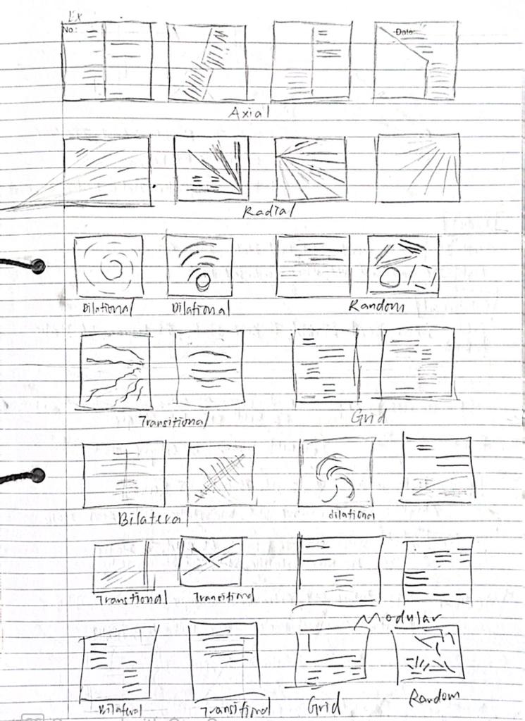
Figure 3.1: Rough sketches (Week 1, 31/8/23)
Fonts used:4. Process
Figure 4.1: InDesign process (Week 1, 1-3/9/23)
5. Attempts (Week 1)
Axial system
Fonts used:
Left: Janson Text LT Std, 75 Bold, ITC New Baskerville Std, Roman
Right: Bodoni Std, Poster Italic, Book
Radial system
Fonts used:
Left: ITC New Baskerville Std, Bold Italic, Roman
Right: ITC Garamond Std, Ultra Condensed, Book
Dilational system
Fonts used:
Left and right: Janson Text LT Std, 75 Bold Italic, 55 Roman, 56 Italic
Random system
Fonts used:
Left: Univers LT Std, 65 Bold Oblique, 55 Roman, 63 Bold Extended Oblique
Right: Univers LT Std, 67 Bold Condensed, 55 Oblique, 53 Extended
Grid system
Fonts used:
Left: Janson Text LT Std, 75 Bold, 55 Roman
Right: ITC Garamond Std, Bold Italic, Book, Book Italic
Transitional system
Fonts used:
Left: Serifa Std, 75 Black, 65 Bold, 56 Italic
Right: ITC New Baskerville Std, Bold Italic, Italic
Modular system
Fonts used:
Left: Futura Std, Extra Bold Oblique, Medium Oblique
Right: Bodoni Std, Poster Italic, Book Italic, Book
Bilateral system
Axial system
Figure 5.1: Axial attempts (Week 1, 1/9/23)
Fonts used:
Left: Janson Text LT Std, 75 Bold, ITC New Baskerville Std, Roman
Right: Bodoni Std, Poster Italic, Book
Radial system
Figure 5.2: Radial attempts (Week 1, 1/9/23)
Left: ITC New Baskerville Std, Bold Italic, Roman
Right: ITC Garamond Std, Ultra Condensed, Book
Dilational system
Figure 5.3: Dilational attempts (Week 1, 2/9/23)
Left and right: Janson Text LT Std, 75 Bold Italic, 55 Roman, 56 Italic
Random system
Figure 5.4: Random attempts (Week 1, 2/9/23)
Left: Univers LT Std, 65 Bold Oblique, 55 Roman, 63 Bold Extended Oblique
Right: Univers LT Std, 67 Bold Condensed, 55 Oblique, 53 Extended
Grid system
Figure 5.5: Grid attempts (Week 1, 2/9/23)
Left: Janson Text LT Std, 75 Bold, 55 Roman
Right: ITC Garamond Std, Bold Italic, Book, Book Italic
Transitional system
Figure 5.6: Transitional attempts (Week 1, 3/9/23)
Left: Serifa Std, 75 Black, 65 Bold, 56 Italic
Right: ITC New Baskerville Std, Bold Italic, Italic
Modular system
Left: Futura Std, Extra Bold Oblique, Medium Oblique
Right: Bodoni Std, Poster Italic, Book Italic, Book
Bilateral system
Left: Bodoni Std, Poster Italic, Book Italic, Book
Right: ITC Garamond Std, Light, Light Italic
6. Further exploration (Week 2)
I realized I also misunderstood the bilateral system and did a multilateral system after Mr. Vinod pointed out the mistake of my peers.
As Mr. Vinod said it's important to balance our layouts, I made some changes to the layout to create a flow.
For transitional, I placed a black background to make the words stand out.
For modular, I did a further exploration by adding boxes to my layout.

Figure 7.3: Final Dilational system (Week 2, 10/9/23)

Figure 7.4: Final Random system (Week 2, 10/9/23)

Figure 7.5: Final Grid system (Week 2, 10/9/23)

Figure 7.6: Final Transitional system (Week 2, 10/9/23)

Figure 7.7: Final Modular system (Week 2, 10/9/23)
Figure 7.9: Final Task 1: Exercise 1 - Typographic Systems (pdf) (without grids) (Week 2, 10/9/23)
Figure 7.10: Final Task 1: Exercise 1 - Typographic Systems (pdf) (with grids) (Week 2, 10/9/23)
Part 1 - Finding type
We must study, break down, and find potential letterforms (5 letters only) inside a selected image of a subject, either organic or man-made. We should select a reference typeface from the 10 typefaces using only uppercase or lowercase letters.
1. Finding image
2. Identifying and extracting letterforms

Figure 9.1: Extraction (Week 2, 10/9/23)

Figure 9.2: Extracted letterforms (Week 2, 10/9/23)
3. Reference font
Figure 10.1: Reference font - Futura Std, Medium (Week 2, 10/9/23)
4. Digitalization
Figure 11.1: Attempt #1 (Week 2, 10/9/23)
Figure 11.2: Attempt #2 (Week 2, 10/9/23)
Figure 11.4: Attempt #4 (Week 2, 12/9/23)
Final Part 1 - Finding type

Figure 12.1: Compiled process (Week 2-3, 10-13/9/23)
Figure 12.2: Original extraction and final letterforms (Week 3, 13/9/23)
Figure 12.3: Final type design (Week 3, 13/9/23)

Figure 12.4: Final 'L' (Week 3, 13/9/23)
Figure 12.5: Final 'E' (Week 3, 13/9/23)
Figure 12.6: Final 'A' (Week 3, 13/9/23)

Figure 12.8: Final 'V' (Week 3, 13/9/23)
Figure 14.2: Finding type poster (pdf) (Week 4, 20/9/23)
HONOR Talents Competition
I have chosen Cultural Prosperity · Celebration: A Totem of Renewing Festive Culture as the design theme. Besides, I've chosen the Wallpapers category and thus, I have to submit the following according to the website:
- Wallpapers and phone cases design (May be used for lock screen images, wallpapers or printed on phone cases. Specifications: size 6,000 x 3,000 px, in JPG format, size ≤ 20M.
- Personalized cards (To be applied to mobile phone desktop and the card display on the dashboard, to allow quick viewing of app content, event reminders, etc. Specifications: size 6,000 x 3,000 px, in JPG format, size ≤ 20M.)
- Main visual design image (Design elements may be used on HONOR products and peripherals. Specifications: size 6,000 x 3,000 px, in JPG format, size ≤ 20M.)
- Animation Design (You can design Always On Display animations, other interactive effects, or screen dynamic effects such as gentle breeze, flowing water, etc. Specifications: size 1920 x 1080 px, in MP4/GIF format, size ≤ 20M. Note: It is not necessary to upload content, but uploading the animation design can boost the innovativeness and technological sense of the work.)
- Design Elaboration (Use words and images to explain your design concept or creative story, so that consumers can better understand the idea behind your creation. Specifications: A4 size, in PDF format, size ≤ 20M.)
Reference and sketch
I used Adobe Photoshop (Ps) to digitalize my artwork as I have problems submitting my artwork with the size of 9933x7016px in Adobe Illustrator (Ai) previously. After creating a new document with the size of 6,000 x 3,000 px, I started to digitize my work.
After that, I copied and pasted my work to complete the phone case design and personalized cards.
Animation
I created a new document with the size of 1920 x 1080px in Photoshop and imported it to Adobe After Effects (Ae). Then, I created a simple animation by moving the rabbits and the clouds together.
Design Elaboration
Lanterns and fairy lights create a cozy and inviting glow over the sky as the sun begins to drop. Like every other festival and celebration, it is best for us to celebrate it with our precious family and friends. Thus, it's a time for community, celebration, and admiration of autumn's beauty. The two rabbits represent the accompaniment of friends or family. This depiction perfectly encapsulates the magic of the season as well as the festive mood of the Mid Autumn Festival.
FEEDBACKS
Week 4
General feedback: Size of the poster is 1024x1024px (square)
Specific feedback: Larger image and text as the main focus is the letterforms.
Week 3
General feedback: Need time management to refine work before deadline. The more time reflect on artwork, the better the results. Be aware of consistency of letterforms. Consider true nature of structure. Look at the letterform (does it reflect characteristics of object). Look at contrast, aesthetic. Consider the combination of multiple objects. The nature of cracks is in texture, don't take the cracks, but the object. The nature of man-made objects such as board pieces or ceiling is already consistent.
Specific feedback: Letterform is depictive and representative. The crossing between strokes is not good. Consider leaves joining together and be aware of the consistency of strokes.
Week 2
General feedback: Be aware of balancing on layouts and graphical element that might overwhelm the content. Baseline on the text will reduce readability. No need to underline text if header is large. Don't italicize words on circle.
REFLECTIONS
Experience
For typographic systems, I found it difficult to come up with a layout even though I tried sketching it out. The pressure to not just meet standards but also come up with layouts that weren't "common" increased because I was so concerned that my work would resemble that of my peers. I've always liked to look at the layouts from my peers as they inspire me in some way. For finding type, I now instinctively find letters from my surroundings as the exercise trained me to do so. Although the refining process is a little bit long, I enjoyed refining it to see the finalized letterforms. I enjoyed doing my poster as well as it looks like a CD cover or film poster. I did the HONOR talents competition artwork close to the deadline, thus, I made the design very simple.
Observations
For typographic system, I found out that other than the font size, alignments and leading, the layout has to have balance between white space. It's crucial to have equal weight distribution even in an asymmetrical design or layout. For finding type, I learnt how to observe more details to find letters in either the whole object or some parts of the object to not make the font look too awkward or forced.
Findings
I found out that I have is a little misunderstanding on the bilateral system when Mr. Vinod told one of my peers that she did a multilateral system instead of bilateral system. For finding type, I realized that the nature of man-made objects such as board pieces or ceiling is already consistent. When I'm doing the poster of finding type, I found that the background of our chosen image and the font that we created is a type of interplay.
FURTHER READINGS
Figure 18.1: Typographic Systems by Kimberly Elam
I found out that there are many types of typographic system compositions. For instance, the axial system compositions. There are narrow column widths, wide column widths, transparency, horizontal movement, shaped background, implied shaped axis, explicit shaped axis and diagonal axis.
Figure 18.2: Types of axial system compositions
Random system compositions, readability of message is often greatly diminished as its purpose is experimentation.
Figure 18.3: Random system (page 78)I thought modular system can only consist of square or rectangles at first.
Figure 18.4: Circle modules (page 129)For finding type, I really enjoyed reading the article written by Mr. Vinod as it provides detailed steps on how to design custom letterforms and it compiles works of my seniors.
Finding Type: A Novel Typographic Exercise
Steps to design custom letterforms
Finding Type: A Novel Typographic Exercise
Steps to design custom letterforms
- Finding an image.
- Deconstructing an image.
- Identifying letterforms.
- Extracting letterforms.
- Identify a reference.
- Refining letterforms.
- Introduce consistency in height, width and contrast.
- Deliberate on retaining or removing characteristics.
- Decide what areas require simplification














Comments
Post a Comment