Advanced Typography Task 2 / Key Artwork and Collateral
20.9.2023 - 4.10.2023 / Week 4 - Week 6
Tan Jian Xin / 0350784
Advanced Typography / Bachelor of Design (Hons) in Creative Media
Task 2 / Key Artwork and Collateral
List / Jump Link
LECTURES
Refer to Task 1 for Week 1 - Week 4.
Week 5: Perception and Organisation
Contrast in typography - To create distinction or differentiation between information

Figure 1.1: Contrast in typography
Contrast in size - Provides a point to reader's attention (Title / Heading)

Figure 1.2: Contrast in size
Contrast in weight - Bold type can stand out in the middle of lighter type of same style

Figure 1.3: Contrast in weight
Contrast in form - Distinction between a capital letter and its lowercase equivalent

Figure 1.4: Contrast in form
Contrast in structure - Different letterforms of different kinds of typefaces

Figure 1.5: Contrast in structure

Figure 1.6: Contrast in texture
Contrast in direction - Opposition between vertical and horizontal, and angles between

Figure 1.7: Contrast in direction
Contrast in color - A second color is often less emphatic in values than plain black and white

Figure 1.8: Contrast in color
Form
- Overall look and feel of elements that make up typographic composition. Creates most visual impact.
- Interplay of meaning and form brings a balanced harmony both in function and expression
- When typeface is perceived as form, it no longer reads as a letter as it has been manipulated by distortion, texture, enlargement and has been extruded into a space.
Organisation / Gestalt
- The whole of anything is greater than its parts
- Law of similarity, proximity, closure, continuation, symmetry, simplicity,....
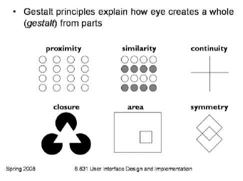
Figure 1.9: Gestalt principles of grouping
INSTRUCTIONS
Task 2A: Key Artwork
For this task, we are going to design a key artwork, which is a wordmark/lettering, but is also an artwork. We are using our name/pseudonym. The final artwork must meet the requirements stated below as it will be used subsequently in Task 2B, collateral.
- Elegant solution
- Well balanced and composed
- Not complicated or confusing that leads to functional and communicable key artwork
1. Ideation and sketches

Figure 1.1: Mind-map about me (Week 3, 16/9/23)


Figure 1.3: Inspiration (Week 3, 16/9/23)

Key artwork overall look:
- Brush strokes: my passion for art
- Rough stroke edges: messy personality
- Enlarged 'X': Luffy's scar (anime character)
- Brush strokes: my passion for art
- Rough stroke edges: messy personality
- Enlarged 'X': Luffy's scar (anime character)
2. Digitalization
Before I started digitizing, Mr. Vinod suggested that the enlarged 'X' could be interpreted as x factor.
Before I started digitizing, Mr. Vinod suggested that the enlarged 'X' could be interpreted as x factor.

I started to digitize my key artwork using Ai, Adobe Illustrator. I chose the 'X' of the bottom attempt as it is a little more messy than the both attempts at the top.
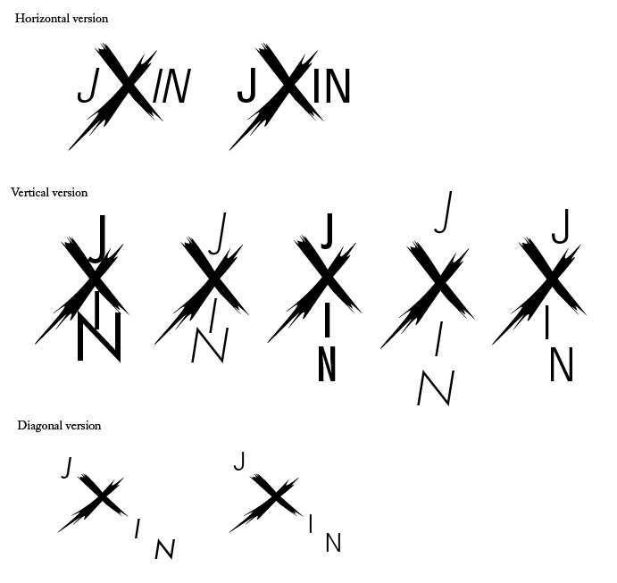 Figure 2.2: Explorations of fonts and forms (Week 4, 22/9/23)


In week 5 class, Mr. Vinod instructed us to print out our key artwork on an A4 sized paper after placing it in 2 square sizes and placing it on top of a black shirt. It is for him to give us feedbacks easier.

After receiving feedbacks from Mr. Vinod, I used quick brush 1 to make the edges of 'X' consistent and although it's not obvious I pulled my letters closer to the 'X'.

After giving Mr. Vinod to check one more time, he asked me to pull the letters closer to the 'X'. Thus, below shows the results.

Task 2B: Collateral
We are tasked to identify 3 collaterals (t-shirt, label pin, and animated key artwork) and an Instagram account (instructed in class) to transform the key artwork into a brand. Before that, we were instructed to pick a color palette for our brand's identity. Thus, I've chosen the colors shown below:
- #2A2F4F
- #917FB3
- #E5BEEC
- #FDE2F3

Figure 3.1: color palette picked (Week 5, 30/9/23)
 Figure 3.2: mix and match (Week 5, 30/9/23)
Collateral #1: T-shirt

Figure 4.1: T-shirt (Week 5, 30/9/23)
Collateral #2: Notebook
 Figure 4.2: Notebook (Week 5, 30/9/23)
Collateral #3: Tote bags

Figure 4.3: Tote bags (Week 5, 30/9/23)
Amendments
After receiving the feedbacks from Mr. Vinod, I made some amendments to my collaterals.

Figure 5.1: Amendments of tote bags (Week 6, 4/10/23)
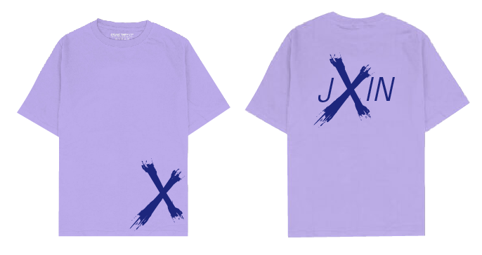
Figure 5.2: Amendments of t-shirt (Week 6, 8/10/23)

Figure 5.3: Changes of notebook (Week 6, 8/10/23)
Animation

Figure 6.1: Key artwork animation (Week 6, 9/10/23)

Figure 6.2: Animated key artwork (Week 6, 9/10/23)
After creating my animation, I realized that I used the wrong color palette. Thus, I changed the color.
We are tasked to identify 3 collaterals (t-shirt, label pin, and animated key artwork) and an Instagram account (instructed in class) to transform the key artwork into a brand. Before that, we were instructed to pick a color palette for our brand's identity. Thus, I've chosen the colors shown below:
- #2A2F4F
- #917FB3
- #E5BEEC
- #FDE2F3
Figure 3.1: color palette picked (Week 5, 30/9/23)
Figure 4.1: T-shirt (Week 5, 30/9/23)
Collateral #2: Notebook
Collateral #3: Tote bags
Figure 4.3: Tote bags (Week 5, 30/9/23)
Amendments
After receiving the feedbacks from Mr. Vinod, I made some amendments to my collaterals.
Figure 5.1: Amendments of tote bags (Week 6, 4/10/23)
Figure 5.2: Amendments of t-shirt (Week 6, 8/10/23)
Figure 5.3: Changes of notebook (Week 6, 8/10/23)
Animation
Figure 6.1: Key artwork animation (Week 6, 9/10/23)

Figure 6.2: Animated key artwork (Week 6, 9/10/23)
After creating my animation, I realized that I used the wrong color palette. Thus, I changed the color.


Figure 6.4: Animated key artwork (Week 6, 11/10/23)
Social media (Instagram)


I wanted the 2 brush strokes as like a horn of mine and thus, I arranged the as the layout shown below.

Figure 7.4: Attempt #3 layout (Week 7, 15/10/23)
Refinement of collaterals

Figure 8.1: Attempt #3 of t-shirt collateral (Week 7, 11/10/23)

Figure 8.2: Attempt #4 of t-shirt collateral (Week 7, 11/10/23)

Figure 8.3: Attempt #3 of notebook collateral (Week 7, 11/10/23)
Final

Figure 9.1: Black and white key artwork (Week 7, 15/10/23)

Figure 9.2: Lightest and darkest color (Week 7, 15/10/23)

Figure 9.3: Darkest and lightest color (Week 7, 15/10/23)

Figure 9.4: Animated key artwork, GIF (Week 7, 15/10/23)
 Figure 9.5: Color palette (Week 7, 15/10/23)

Figure 9.6: T-shirt (Week 7, 15/10/23)

Figure 9.7: T-shirt (Week 7, 15/10/23)

Figure 9.8: Notebook (Week 7, 15/10/23)

Figure 9.9: Tote bags (Week 7, 15/10/23)
 Figure 9.10: Screen grab of Instagram layout (Week 7, 15/10/23)
Figure 9.11: Final (pdf) (Week 7, 15/10/23)

Figure 9.1: Black and white key artwork (Week 7, 15/10/23)

Figure 9.2: Lightest and darkest color (Week 7, 15/10/23)

Figure 9.3: Darkest and lightest color (Week 7, 15/10/23)
Figure 9.4: Animated key artwork, GIF (Week 7, 15/10/23)


Figure 9.6: T-shirt (Week 7, 15/10/23)

Figure 9.7: T-shirt (Week 7, 15/10/23)

Figure 9.8: Notebook (Week 7, 15/10/23)

Figure 9.9: Tote bags (Week 7, 15/10/23)
Instagram profile: https://instagram.com/jxin89_my?igshid=MzMyNGUyNmU2YQ==

Figure 9.11: Final (pdf) (Week 7, 15/10/23)
Week 7
General Feedback: Tight identity can feel color scheme. Enlarge certain parts of collaterals to make it more interesting. Repetitive posts should be altered.
Specific Feedback: The sides of happy, messy, and funny should be different. The pictures should look professional, creative and stands out. Post animation in the form of mp4.
Week 6
General Feedback: Key artwork should be readable and legible to be pronounceable. Decide on one color scheme to have contrast. Think of what to do to expand the wordmark into an identity. Repetition creates a pattern, however, if the wordmark is too noisy, it reduces readability. Be aware of shadow on design. Colors used have to be strong, to make it stand out. Thick and thin lines will not be readable for wordmark. Pastel shades are the worst shades to use for an identity. Specific Feedback: No problem with wordmark, but don't just copy and paste it on the collateral. Week 5 Specific Feedback: The distance between letters should be closer. Try using brush tool in Ai to make the edges of 'X' more consistent. Week 4 General Feedback: Need to have meaning behind visuals. If you want something to be communicable, ask someone. Be careful with elements used, not too much as people might associate something with it. Form follows function, if not, it's decoration. To evaluate the form, take the form created and place it on a t-shirt, ask yourself how much you are willing to pay. Specific Feedback: Can understand what I'm trying to convey. X can be interpreted like an x factor or it factor. It's quite usable. A good mark can be interpreted in many ways as it is expandable.
REFLECTIONS
Experience
I really enjoyed Task 2A as it makes me decipher my personality and passion in words, in order to visualize it. As it requires me to make my key artwork represent a part of me, I started to make a mind-map on what I enjoyed doing, my favorite things, genres and my zodiac sign (not really). It made me know myself better in a way. For Task 2B, I don't really know how to expand my identity as I just copy and pasted my key artwork on t-shirts, notebooks, and tote bags for the first attempt.
Observations
I saw the works from my peers and learnt a lot from them. For instance, colors used for identity should be strong, unlike pastel colors, for it to stand out. Besides, I realized that repetition on wordmark that is noisy reduces readability, and results in distraction.
Findings
Form follows function. Ask a random person who doesn't know you to see if you want something to be communicable. Think of ways to expand an identity creatively.
FURTHER READINGS

Figure 10.1: Cover page of 'Designing with type: The Essential Guide to Typography' by James Craig
I've read about spot colors (also known as solid colors). Solid colors are commonly used in two-and three-color jobs, such as the cover shown above.
Tints - A color printed less than its full density, making a lighter shade of the same color. Readability is affected by the typeface, font size, and tint used.
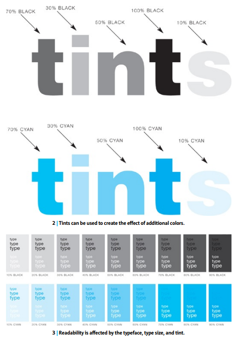 Figure 10.2: Pg 188 of Designing with type (Tints and readability)
Process colors (CMYK) - Cyan (blue), magenta (red), yellow, and black are used to reproduce full-color images.

Figure 10.3: Pg 192 of Designing with type (CMYK)

Figure 10.4: Pg 193 of Designing with type (recreated colors)
Steps to reproduce full-color images
1. Art is scanned to break down the original image into the four process colors. (Figure .3)
2. Once art has been scanned, CMYK will appear as tints, will approximate the full range of colors found in original image when combined in printing.
3. When using process inks, it is possible to define combinations of solid colors and tints (screens) of two or more colors to create unique colors. (Figure .4)
Problems arise
1. If one or more colors are out of registration, the type will be blurred. (Consider typeface, font size carefully).
2. During the attempt to print type on a full-color photograph, the problem of finding an area that is not too "busy" so the type can be read is challenging. (Study illustration on facing page to see how font size, color, and the nature of the background affects readability).
Tints - A color printed less than its full density, making a lighter shade of the same color. Readability is affected by the typeface, font size, and tint used.
Process colors (CMYK) - Cyan (blue), magenta (red), yellow, and black are used to reproduce full-color images.
Figure 10.3: Pg 192 of Designing with type (CMYK)
Figure 10.4: Pg 193 of Designing with type (recreated colors)
Steps to reproduce full-color images
1. Art is scanned to break down the original image into the four process colors. (Figure .3)
2. Once art has been scanned, CMYK will appear as tints, will approximate the full range of colors found in original image when combined in printing.
3. When using process inks, it is possible to define combinations of solid colors and tints (screens) of two or more colors to create unique colors. (Figure .4)
Problems arise
1. If one or more colors are out of registration, the type will be blurred. (Consider typeface, font size carefully).
2. During the attempt to print type on a full-color photograph, the problem of finding an area that is not too "busy" so the type can be read is challenging. (Study illustration on facing page to see how font size, color, and the nature of the background affects readability).


Comments
Post a Comment