Typography Task 3 / Type Design & Communication
23.5.2023 - 20.6.2023 / Week 8 - Week 12
Tan Jian Xin /
0350784
Typography / Bachelor of Design (Hons) in Creative
Media
Task 3 / Type Design & Communication
List / Jump Link
LECTURES
Refer to Task 1


INSTRUCTIONS
Task 3: Type Design & Communication
I will create a typeface that has the hallmarks of a good typeface; subtlety or character, presence, legibility and readability. I will design: (a e t k g r i y m p n ! # , .). Upon completion of the font, I will create a basic A4 size poster displaying my font.
1. Research

Figure 1.1: Anatomy of typeface (Week 8, 21/5/23)


Guides on constructing punctuations
Periods, commas, colon, semicolon, ellipsis:
https://www.instagram.com/p/CRjdPtSjz5K/
Exclamation, asterisk, apostrophe, slash, number sign:
https://www.instagram.com/p/CVxysKALPVo/
Exclamation, question mark:
https://www.instagram.com/p/CSZhQUpLd5K/
Periods, commas, colon, semicolon, ellipsis:
https://www.instagram.com/p/CRjdPtSjz5K/
Exclamation, asterisk, apostrophe, slash, number sign:
https://www.instagram.com/p/CVxysKALPVo/
Exclamation, question mark:
https://www.instagram.com/p/CSZhQUpLd5K/
- writing diagonal, horizontal, vertical and circular lines for all 5 tools in 5 different ways for each tool
- writing AOTMX for all 5 tools in 5 different ways for each tool
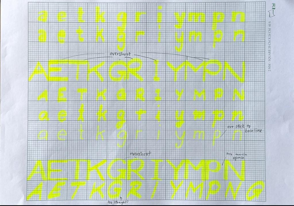
- select 1 option from the 5 different options from each tool and write "a e t k g r i y m p n" in the selected style. Choose either UPPERCASE or lowercase to write in.
5 tools:
1. Artline 200 FINE 0.4
2. ZHIXIN 0.5
3. FABER-CASTELL TEXTLINER 38
4. FABER-CASTELL WATERCOLOUR 426
5. PILOT BOARD MASTER (Fine Bullet)
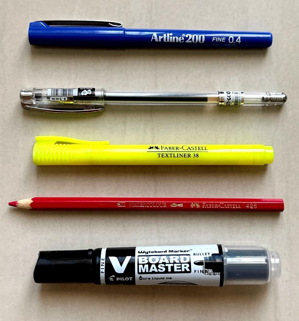
Figure 2.1: 5 tools used (Week 8, 21/5/23)
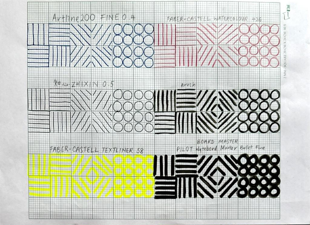 Figure 2.2: First try of writing lines and circles (Week 8,
21/5/23)
Figure 2.2: First try of writing lines and circles (Week 8,
21/5/23)

Figure 2.3: 5 different ways for lines and 'AOTMX' (Week 8, 22/5/23)

Figure 2.4: First compilation for 5 different tools (Week 8,
23/5/23)
After receiving feedback from Mr. Vinod, I started to explore writing using each tool.

Figure 2.5: Sketches and practices (Week 8, 23/5/23)
1. Artline 200 FINE 0.4

2. ZHIXIN 0.5

3. FABER-CASTELL TEXTLINER 38
4. FABER-CASTELL WATERCOLOUR 426

5. PILOT BOARD MASTER (Fine Bullet)
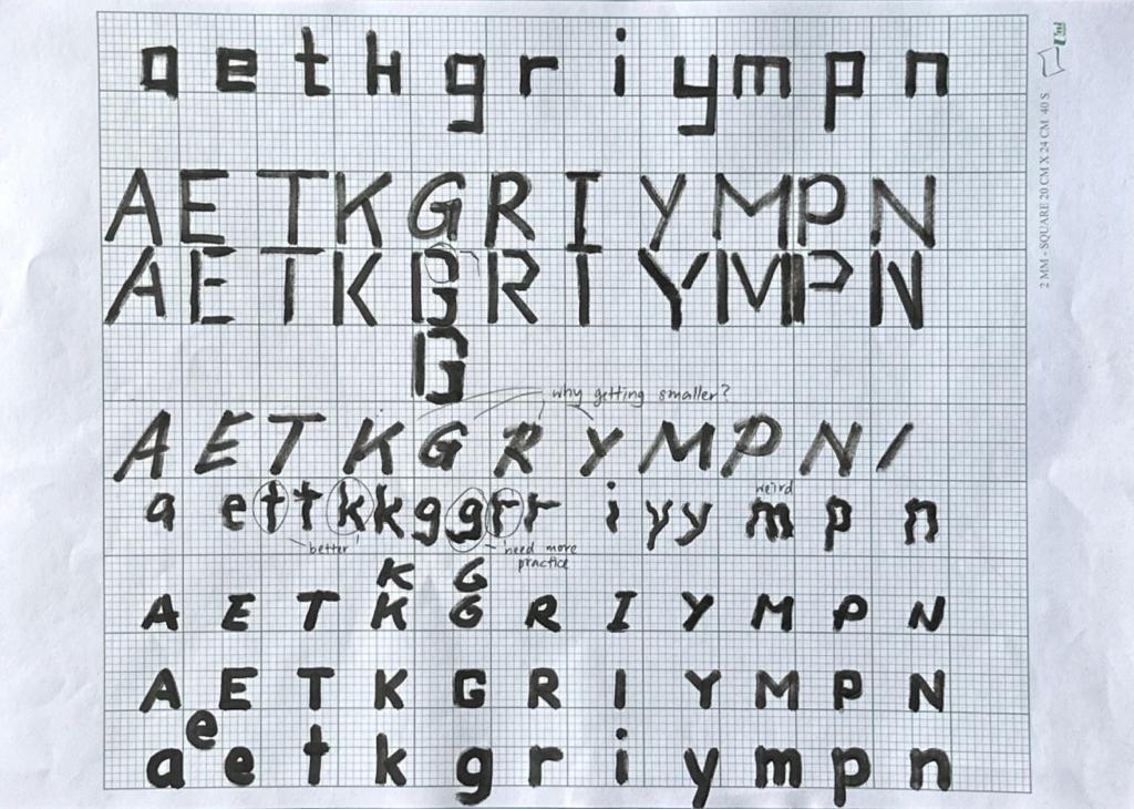
Figure 2.10: PILOT BOARD MASTER (Fine Bullet) (Week 8,
25/5/23)


3. Deconstructing letters
I decided to deconstruct the letter from Univers LT Std (85 Extra Black Oblique) as I think its strokes are more similar to my typeface.
I decided to deconstruct the letter from Univers LT Std (85 Extra Black Oblique) as I think its strokes are more similar to my typeface.
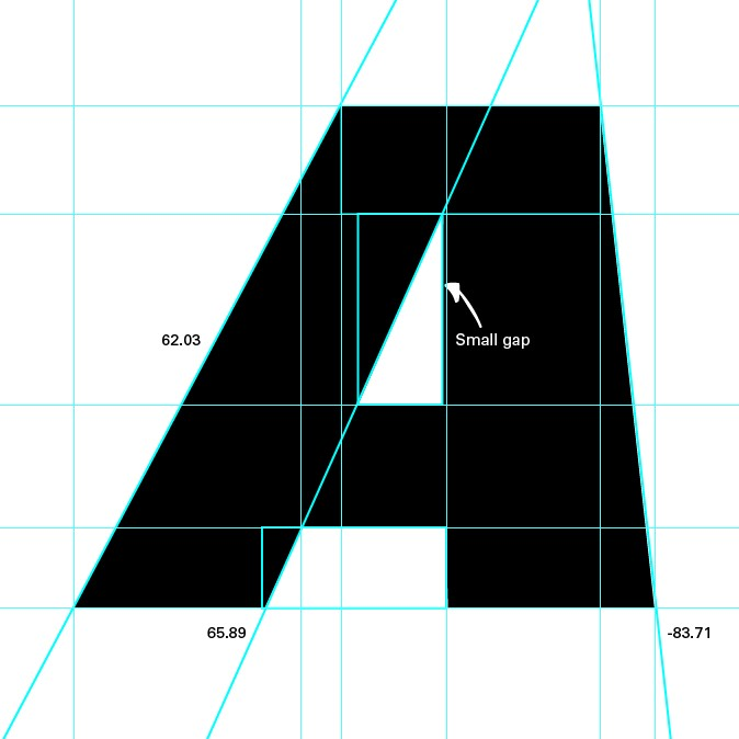
Figure 3.1: Deconstruction of letter 'A' (Week 9,
1/6/23)

Figure 3.2: Deconstruction of letter 'G' (Week 9, 1/6/23)
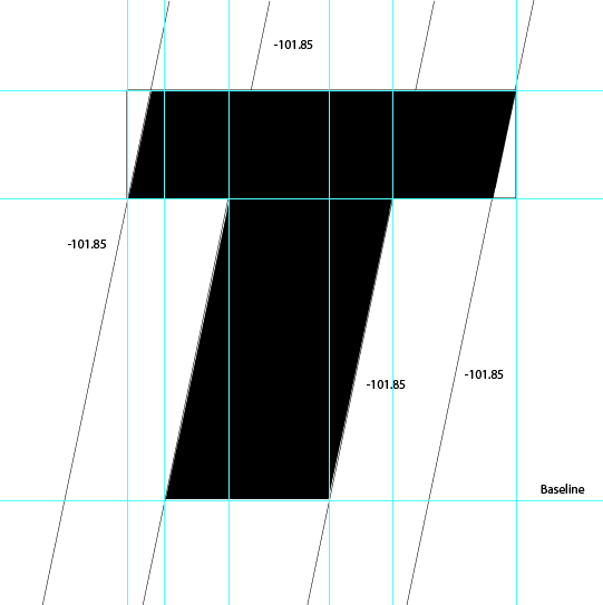
Figure 3.3: Deconstruction of letter 'T' (Week 9, 1/6/23)
What I realized through deconstruction of letters:
- A
- there's a small gap in the triangle of letter 'A'
- the angle of the left and right strokes of 'A' are different
- G
- there's overshoot
- the angles of the vertical stroke from inside and outside are different
- T
- the angles are the same
- the vertical stroke is wider than the horizontal stroke
After placing the guidelines (500pt x-height; cap line; descender and ascender line; baseline and median line), I started to digitalize my font in Adobe Illustrator (Ai) by importing the sketches from my writing practice and tracing it out.
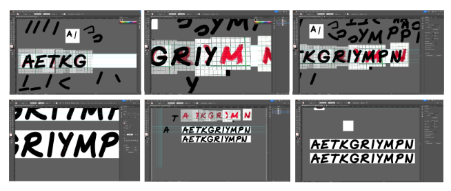
Figure 4.1: Digitalization process (Week 9, 3/6/23)
 Figure 4.2: Attempt 1 (Week 9, 3/6/23)
 Figure 4.3: original lettering and digitized letterform (Week 10,
6/6/23)
Figure 4.3: original lettering and digitized letterform (Week 10,
6/6/23)
 Figure 4.4: Attempt 2 (Week 10, 10/6/23)
 Figure 5.2: Exporting fonts to Fontlab 7 (Week 10, 10/6/23)
 Figure 5.3: Kerning process (Week 10, 10/6/23)
 Figure 5.4: Attempt 3 (Week 11, 17/6/23)

Figure 5.5:development of font (Week 11, 17/6/23)
 Figure 5.6: FontLab Screenshot (Week 11, 18/6/23)

Figure 5.7: Amendments (Week 11, 18/6/23)
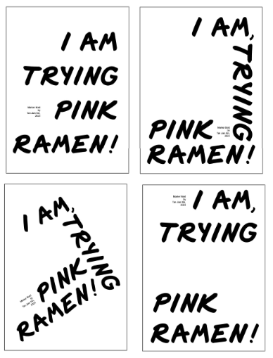 Figure 6.1: Poster layouts (Week 11, 18/6/23)
Font Dimensions from baseline
Ascender line: 711pt
Cap line: 676pt
Median line: 500pt
Descender line: -220pt
Ascender line: 711pt
Cap line: 676pt
Median line: 500pt
Descender line: -220pt
5. FontLab
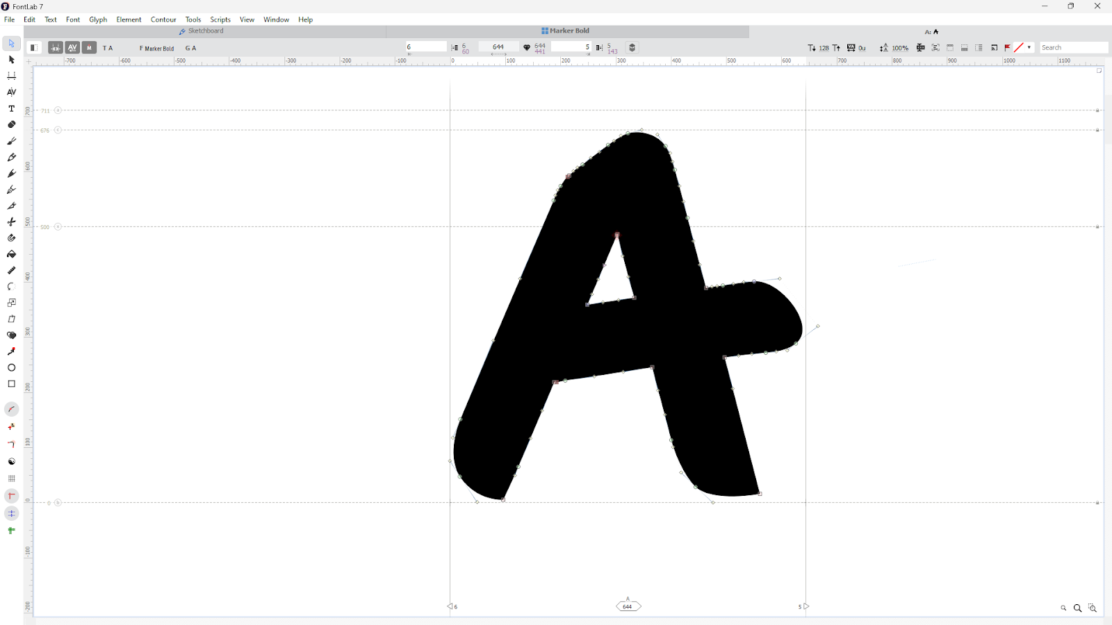
Figure 5.1: Copy and pasting fonts to Fontlab 7 (Week 10, 10/6/23)
After receiving feedbacks from Mr, Vinod, I went back to Adobe
Illustrator and made some adjustments.
Figure 5.5:development of font (Week 11, 17/6/23)
Figure 5.7: Amendments (Week 11, 18/6/23)
6. Poster

Figure 6.2: Poster #1 (Week 11, 18/6/23)

Figure 6.3: Poster #2 (Week 12, 20/6/23)
 Figure 6.4: Poster #3 (Week 12, 20/6/23)
 Figure 6.5: Poster #4 (Week 12, 20/6/23)
 Figure 7.1: Final Task 3 "Marker Bold" jpeg (Week 12, 20/6/23)
Figure 7.2: Final Task 3 "Marker Bold" pdf (Week 12, 20/6/23)
 Figure 7.3: Final Task 3 "Marker Bold" poster jpeg (Week 12, 20/6/23)
Figure 7.4: Final Task 3 "Marker Bold" poster pdf (Week 12, 20/6/23)


7. Final Outcome
Font download: https://drive.google.com/file/d/1xHHH5xmxaWmI9a15l432cVpTf4c0FHSr/view?usp=sharing
Font download: https://drive.google.com/file/d/1xHHH5xmxaWmI9a15l432cVpTf4c0FHSr/view?usp=sharing
Figure 7.2: Final Task 3 "Marker Bold" pdf (Week 12, 20/6/23)

Figure 7.4: Final Task 3 "Marker Bold" poster pdf (Week 12, 20/6/23)
FEEDBACKS
Week 8 General Feedback: Letters should sit on baseline Specific Feedback: 3/5 are unusable because they are too thin. The 5th one is not yet formed properly and I think you need to explore writing that to get it to a more appropriate standard before a decision can be made. Getting there. Go with 4. You will need to now practice writing in that style and later identify the best letters you can use for digitization (when instructed). For now keep practicing writing in that style.
Week 9 General Feedback: Identify letterform that has too much character such as major gaps and curve. Then, identify the best of each and place it together during digitalization process. It is crucial promote consistency in each letter. For instance, the vertical and horizontal strokes should be the same in each letter. However, variations in strokes may be introduced to promote uniqueness in letterforms. It is recommended to deconstruct the letters that are similar to our typeface to study the details of the letters. Specfic Feedback: Take picture of the best letterform and trace it out using pen tool in Adobe Illustrator (Ai).
Week 10 General Feedback: Vertical and horizontal strokes should have consistency and control (1 or 2 variations may be acceptable). Refine writing to a font. Letterforms must be connected and united into one form. Specific Feedback: Refine the rounded form of the fonts to give the font more character.
Week 11 General Feedback: Letter 'G' needs overstroke. Vertical strokes on punctuations needs consistency with letterforms. Specific Feedback: Good attempt. Comma, period points and exclamation marks needs work. Letter 'G' needs rework, letter 'K' axis needs to be slanted more, letter 'T' doesn't need overshoot. Week 12 General Feedback: When formatting text at large size, look at kerning. Typefaces have to be same font size. The poster should have dynamic and impact to attract readers. Specific Feedback: Comma needs work, there's massive space in poster.
REFLECTIONS Experience As I’ve attended the talk by Low Hsin Yin, I’ve come to know more about the commercial vehicle labels in Malaysia. For instance, the writing instruments, methods, and practices done by the signwriters. At the beginning of this task, I thought I couldn’t create a font as I am not experienced it, but when I started writing through the exercise Mr. Vinod gave, I found it interesting as I kept thinking of ways to write using different tools and angles. Observation Besides paying more attention to the letters around me to gain inspiration from it, I started to find out more of the details of letters through deconstruction. Moreover, I realized that it is harder to maintain the consistency of the font if the font has more character. It is important for a typeface to have consistency on the vertical and horizontal strokes too. I found out that punctuations such as the number sign, # are harder to digitalize compared to typefaces. Findings I found out that I started to find letters around me. For instance, I would look at the letters on my keyboard, plastic bags that has various brands, shampoos with letters and even letters on my clothes. As Mr. Vinod says, there are various topics around me that I’ve not yet realize, as I haven’t developed an interest in them. Thus, I’ll come to realize it more in the coming semester, which I’ll have a design research methodology module.
FURTHER READINGS

Figure 8.1: Cover page of 'Type on screen: A critical guide for designers, writers, developers, & students' by Ellen Lupton

Figure 8.2: Students developing a typeface in 3 weeks (pg
46)
The students in MICA workshop first made drawings, then digitalize
their letterforms and created type specimens. As inspiration, students
used found type, such as letters from public signs to develop their own
typeface. 
Figure 8.3: Design: Anne Lee, 2013 (pg 47)
I read about the optical considerations on type as Mr. Vinod mentioned something about mechanical proportionality and optical proportionality.
Lettering found on a building in Philadelphia, LANVALE, imitates
the dimensionality of the building's signage.

Figure 8.4: Cover page of 'Designing with type: The Essential Guide to Typography' by James Craig
Letterspacing and wordspacing (Kerning)
Inconsistency in letterspacing or wordspacing tends to hinder readability.
Examples: Between circular letters, such as two Os, less space is required than between straight letters, such as an I and an H (1). Angular letters and letters that have overhanging strokes, such as V, Y, L, A, and T, also require less space and, in some cases, extreme kerning (2)

Figure 8.5:Page 166 of 'Designing with type: The Essential Guide to Typography'
Words set in all caps, such as titles or heads, are generally improved by letterspacing and optical adjustments. Letterspacing lowercase letters, although less common, can also be effective (3)
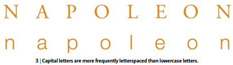

Figure 8.6: Page 167 of Designing with type: The Essential Guide to Typography'
Besides, I also read about the punctations.
Hung punctuation
Small punctation marks (commas, periods, hyphens, apostrophes, asterisks, and quotation marks) have less weight than full-size characters and, when set inside the measure, may create visual indents in the flush vertical alignment. For this reason, you may wish to consider setting small punctuation marks outside the measure in order not to disturb the vertical type alignment. When punctuation marks are set outside the type measure, they are referred to as “hung” punctuation (1).
Figure 8.7: Page 170 of Designing with type: The Essential Guide to Typography'
Larger punctuation marks (colons, semicolons, question marks, and
exclamation points), which have the same visual weight as full-size
characters, are set within the measure. The em-dash, because of its
length, is also set within the measure.
Figure 8.8: Page 171 of Designing with type: The Essential Guide to Typography'


Comments
Post a Comment