Typography Task 1 / Exercises
4.4.2023 - 5.2.2023 / Week 1 - Week 5
Tan Jian Xin / 0350784
Typography / Bachelor of Design (Hons) in Creative Media
Task 1 (Exercise 1 &2)
List / Jump Link
LECTURES
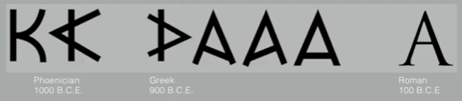
Week 1: Early letterform development: Phoenician to Roman

Evolution of Phoenician letter (left) Phoenicians votive stele Carthage (right)
- The forms of uppercase letterforms (for nearly 2000 years the only letterforms) evolved out of tools and materials such as scratching into wet clay with sharpened stick and carving into stone with a chisel.
- Greeks changed the direction of writing by developing a style of writing called 'boustrophedon' (how the ox ploughs) which meant that the lines of text read alternately from right to left and left to right.
- Phoenicians, like other Semitic peoples (Middle East) wrote from right to left.

Greeks writing style 'boustrophedon'
- Etruscan (and then Roman) carvers working in marble painted letterforms before inscribing them.
- A change in weight from vertical to horizontal, a broadening of the stroke at start and finish - carried over into the carved letterforms.
Roman letterforms - B.C.E = before the zero year / before common era
Development of letter A
Hand script from 3rd - 10th century C.E.
Square capitals (4th or 5th century) - Square capitals (can be found in Roman monuments)
- Serifs added to the finish of main strokes
- variety of stroke width was achieved by the reed pen held at an angle of approximately 60 degrees off the perpendicular.
Rustic capitals (late 3rd - mid 4th century) - Compressed version of square capitals (Rustic capitals)
- Pen or brush held at an angle of approximately 30 degrees off the perpendicular
- Faster and easier to write, but they were slightly harder to read due to its compressed nature
- Both square and rustic capitals were typically reserved for documents of some intended performancebeginning of lowercase letterforms
- Lowercase letterform was a result of writing uppercase letter forms quickly
Uncials (4th - 5th century) - Uncia is Latin for a twelfth of anything
- Uncials is simply small letters
- The broad forms of uncials are more readable at small sized than rustic capitals
Half-uncials - Half-uncials mark the formal beginning of lowercase letterforms 2000 years after the origin of the Phoenician alphabet.
Caloline miniscule (C.925) - Charlemagne, the first unifier of Europe since the Romans, issued an edict in 789 to standardize all ecclesiastical texts. He entrusted this task to Alcuin of York, Abbot of St Martin of Tours
- The monks rewrote the texts using both majuscules (uppercase), miniscule, capitalization and punctuation which set the standard for calligraphy for a century.
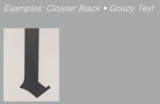
Blackletter to Gutenberg's type
Blackletter - In northern Europe, a condense strongly vertical letterform known as Blackletter or textura gained popularity
- In the south, a rounder more open hand gained popularity, called 'rotunda'
- The humanistic script in Italy is based on Alcuin's miniscule
42 line bible, Johann Guttenberg, Mainz - Gutenberg's skills included engineering, metalsmithing, and chemistry
- He marshaled them all to build pages that accurately mimicked the work of the scribe's hand - Blackletter of northern Europe
- His type mold required a different brass matrix, or negative impression, for each letterform
Printing layout of bible - Printing can be done much more quickly rather than documenting of information
- Formation of words and sentences through the development of matrices, results in formation of paragraphs in pages
- Bible is wanted by everyone at that time
- Able to produce more books than a scribe (record-keeper) - result in publishing large amounts of text
Typography: Development / TimelineDevelopment / timelineText type classification (Dates of origin approximated to the nearest quarter century) - Based on one devised by Alexander Lawson only covers the main form of text type
- 1450 Blackletter - Earliest printing type, forms were based upon the hand-copying styles that were used for books in northern Europe
1450 Blackletter - 1475 Oldstyle - Based on lowercase forms used by Italian humanist scholars for book copying (themselves based upon th eninth-century Caroline minisule) and the uppercase letterforms found inscribed on Roman ruins, the forms evolved away from their calligraphic origins over 200 years. as they migrated across europe, from Italy to England
1475 Oldstyle - 1500 Italic - The first italics were condensed and close-set, allowing more words per page
- Although initially considered their own class of type, italics were soon cast to complement roman forms.
- Since sixteenth century, virtually all text typefaces have been designed with accompanying italic forms
1500 Italic - 1550 Script - Originally and attempt to replicate engraved calligraphic forms, this class of type is not appropriate in lengthy text settings.
- In shorter applications, it has always enjoyed wide acceptance
- Forms now range from formal and traditional to the casual and contemporary.
1550 Script - 1750 Transitional - A refinement of oldstyle forms, this style was achieved in part because of advances in casting and printing
- Thick to thin relationships were exaggerated, and brackets were lightened
1750 Transitional - 1775 Modern - Represents a further rationalization of oldstyle letterforms
- Serifs were unbracketed and the contrast between thick and thin strokes extreme
- English versions (like Bell) are also known as Scotch Romans and more closely resemble transitional forms
1775 Modern - 1825 Square Serif / Slab Serif - Originally heavily bracketed serif, with little variation between thick and thin strokes, these faces responded to the newly developed needs of advertising for heavy type in commercial printing
- As they evolved, brackets were dropped
1825 Square Serif / Slab Serif - 1900 Sans Serif - These typefaces eliminated serifs altogether
- Forms were first introduced by William Caslon IV in 1816, only become wide-spread at the beginning of the twentieth century
- Variation tended toward either humanist forms (Gill Sans) or rigidly geometric (Futura)
- Strokes were flared to suggest the calligraphic origins of the form (Optima) occasionally
- Referred to as grotesque (from German word grotesk) and Gothic
1900 Sans Serif - 1990 Serif / Sans Serif - A recent development, enlarges the notion of a family of typefaces to include both serif and sans serif alphabets (and often stages between the two)
1990 Serif / Sans Serif


Week 2: Text / Tracking: Kerning and Letterspacing

Difference without kerning and with kerning
- Kerning refers to automatic adjustment of space between letters.
- Often mistakenly referred to as letterspacing, which is to add space between letters
- Tracking is the addition and removal of space in a word or sentence
Normal tracing, loose tracking and light tracking - Uppercase letterforms are drawn to be able to stand on their own, whereas lowercase letterforms require the counterform (black spaces between the white) created between letters to maintain the line of reading
Counterform - Adding letterspacing results in breaking of counterform which then reduces the readability of the word or sentence.
Example of counterforms being reduced or changedText / Formatting Text - Flush left - Most closely mirrors the asymmetrical experience of handwriting.
- Each line starts at the same point but ends wherever the last word on the line ends
- Spaces between words are consistent throughout the text, allowing the type to create an even gray value (text on a white page)
Flush left - Centered - Imposes symmetry upon the text, assigning equal value and weight to both ends of any line
- It transforms fields of text into shapes, thereby adding a pictorial quality to material that is non-pictorial by nature.
- As the centered type creates a strong shape on the page, its important to amend line breaks so that the text does not appear too jagged
Centered - Flush right - Emphasis on the end of a line as opposed to its start
- Useful in situations (like captions) where the relationship between text and image might be ambiguous without a strong orientation to the right
Flush right - Justified - Imposes a symmetrical shape on text like centering
- Achieved by expanding or reducing spaces between words and sometimes, between letters
- The resulting openness of lines can occasionally produce 'rivers' of white space running vertically through the text
- Careful attention to line breaks and hyphenation is required to amend this problem whenever possible
Justified - Designers tend to set type one way or another depending upon several factors, personal preference, prevailing culture and the need to express play important roles
- When setting the field of type, keep in mind the typographer's first job - clear, appropriate presentation of the author's message
- Type that calls attention to itself before the reader can get to the actual words is simply interference, and should be avoided
- Quite simply if you see the type before you see the words, change the type
- Don't use script typefaces in capital letters the way the RSVP is on the left. It can be used in the way on the right
Example of typesText / Texture - Type with a relatively generous x-height or relatively heavy stroke width produces a darker mass on the page than type with a relatively smaller x-height or lighter stroke
- Sensitivity to differences in colour (gray value of text) is fundamental for creating successful layouts
- Ascender and descender < x-height results in higher readability
Anatomy of a typeface - Font size is 10, leading is 3.5 points larger than the font size of text
- Not meant be read on screen
- Contrast - thick and thin strokes
Different typeface with same font size and leadingText / Leading and Line Length - Goal of setting text type - allow easy, prolonged reading
- A field of type should occupy the page as much as photograph does
- Type size - Text type should be large enough to be read easily at arms length - imaging yourself holding a book in your lap
- Leading - Text that is set too tightly encourages vertical eye movement; a reader can easily loose her place. Type that is set too loosely creates striped patterns that distract the reader from the material at hand
- Line Length - Shorter lines require less leading; longer lines more. A good rule of thumb is to keep line length between 55-65 characters. Extremely long or short line lengths impairs reading
tight leading and loose leading - The color is too dark on the left and too light on the right
Different leading same typeface - 10/12 best color
Text / Type Specimen Book - Type specimen book shows samples of typefaces in various different sizes. Without printed pages showing sample of typefaces at different sizes, no one can make a reasonable choice of type.
- A type specimen book (or ebook for screen) is to provide an accurate reference for type, type size, type leading, type line length etc.
Sample type specimen sheet - Composition requirement - Text should create a field that can occupy a page or a screen
- Think of your ideal text as having a middle gray value (on the left), not a series of stripes (on the right)
Composition requirement - It is often useful to enlarge type to 400% on screen to get a clear sense of the relationship between descenders on one line and ascenders on the line below


Difference in leading
Week 3: Text / Indicating Paragraphs
- Pilcrow, ¶ - A holdover from medieval manuscripts seldom use today (paragraph space)
- Line space (leading) is shown below. If the line space is 12pt. the paragraph space is 12pt. This ensures cross-alignment across columns of text
Line space (leading)


- Standard indentation is shown below. Usually, the indent = size of the line spacing or point size of your text
- Newspapers used to use indentation and remove paragraph spacing to save space & cost (print).
- No LEFT ALIGNMENT when using indentation (no ragging on right)
- BEST when text is JUSTIFIED
Standard indentation - Method of extended paragraphs creates unusually wide columns of text
- There can be strong compositional or functional reasons for choosing it.
- Sometimes used in academic writings, not generally used.
Extended paragraph indentationText / Widows and Orphans - Widow - A short line of type left alone at the end of a column of text
- Orphan - A short line of type left alone at the start of a new column
- WIDOWS AND ORPHANS MUST NEVER OCCUR IN MY DESIGNS
Widows and orphans - In justified text, both widows and orphans are considered serious gaffes
- Flush right and ragged left text is some what more forgiving towards widows (only a bit), orphans remain unpardonable
- Only solution for widows is to rebreak your line endings through out your paragraph so that the last line of any paragraph is not noticeably short
- Orphans require more care. Careful typographers make sure that no column of text starts with the last line of the preceding paragraph.
- Kerning / letter spacing at most alt + left/right arrow 3 times, tracking must be 5
Text / Highlighting Text - Diagram below shows simple examples on how to highlight text within a column of text
Text highlighting with italics (left) bold (right)Text highlighting with color (right) bold (left) - Changing of color of body text can only use BLACK, CYAN, MAGENTA, YELLOW
- Changing of type family is shown below - Sans serif font (Univers) has been reduced by .5 to match the x-height of the serif typeface 8 ≠ 7.5
different type family has different x-height - To ensure visual cohesion of text, numbers or All Capital acronyms embedded in text is reduced by .5 as well.
Reducing font size by 0.5 to enhance visual cohesion of text - Highlighting text by placing a field of color at the back of text - maintaining the left reading axis (right) ensures readability is at its best
- The one on the right might be useful to pragmatic reasons
Placing a field of color - To maintain a strong reading axis, sometimes it is necessary to place typographic elements outside the left margin of a column of type (extending as opposed to indenting)
- Ex (right): quotation
Placing typographic elements (bullet points) - Quotation marks - can create a clear indent, breaking left reading axisQuotation marks
Text / Headline within Text - A head - Indicates a clear break between the topics within a section
- 'A' heads are set larger than text, in small caps and in bold. The fourth example shows an 'A' head 'extended' to the left of the text
Bold ; extended to left ; Larger than text ; small caps (left to right) - B head - Subordinate to A heads. B heads indicate a new supporting argument or example for topic at hand
- They should not interrupt the text as strongly as A heads do. B heads are shown in small caps, italic, bold serif, and bold san serif.
- Spacing following leading space
small caps ; italic ; bold serif ; bold san serif (left to right) - C head - Highlights specific facets of material within B head text, although not common
- Not materially interrupt the flow of reading. C heads are shown in small caps, italics, serif bold and san serif bold
- C heads in this configuration are followed by at least an em space for visual separation
small caps ; italics ; bold serif ; bold san serif (left to right) - Putting a sequence of subheads together = hierarchy
Combining A head, B head and C head
Text / Cross Alignment - Cross aligning headlines and captions with text type reinforces the architectural sense of the page - the structure - while articulating the complimentary vertical rhythms
- Four lines of caption type (leaded 9 pts.) cross-align with three lines of text type (leaded to 13.5 pts)Cross aligning
- One line of headline type cross-aligns with two lines of text type, and (right; bottom left) four lines of headline type cross-align with five lines of text type
Cross aligning with headlineBasic / Describing letterforms - Baseline - Imaginary line the visual base of letterforms
- Median - Imaginary line defining the x-height of letterforms
- X-height - Height in any typeface of the lowercase 'x'
Anatomy of letterforms - Stroke - Any line that defines the basic letterform
- Apex / Vertex - Point created by joining two diagonal stems (apex above and vertex below)
- Arm - Short strokes off the stem of the letterform, either horizontal (E, F, L) or inclined upward (K, Y)
- Ascender - Portion of the stem of a lowercase letterform that projects above the median
- Barb - Half-serif finish on some curved stroke
- Beak - Half-serif finish on some horizontal arms
- Bowl - Rounded form that describes a counter (may be open or closed)
- Bracket - Transition between serif and stem
- Cross Bar - Horizontal stroke in a letterform that joins two stems together
- Cross stroke - Horizontal stroke in a letterform that joins two stems together
- Crotch - Interior space where two strokes meet
- Descender - Portion of the stem of a lowercase letterform that projects below the baseline
- Ear - Stroke extending out from the main stem or body of the letterform
- Em / en - width of an uppercase M (initially), em is now distance equal to the size of the typeface (an em in 48 pts, for example). An en is half the size of an em.
- Most often used to describe em/en space and em/en dashes
- Finial - Rounded non-serif terminal to a stroke
- Leg- Short stroke off the stem of the letterform, either at the bottom of the stroke (L) or inclined downward (K, R)
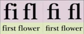
- Ligature - Character formed by the combination of two or more letterforms
- Link - Stroke that connects the bowl and the loop of a lowercase G
- Loop - In some typefaces, the bowl created in the descender of the lowercase g
- Serif - Right angled or oblique foot at the end of the stroke
- Shoulder - Curved stroke that is not part of a bowl
- Spine - Curved stem of S
- Spur - Extension the articulates the junction of the curved and rectilinear stroke
- Stem - Significant vertical or oblique stroke
- Stress - Orientation of the letterform, indicated by the thin stroke in round forms
- Swash - Flourish that extends the stroke of the letterform
- NEVER USE SWASHES IN CAPITAL LETTERS TOGETHER
- Tail - Curved diagonal stroke at the finish of certain letterforms
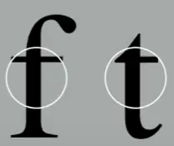
- Terminal - Self-contained finish of a stroke without a serif
- May be flat ('T' above), flared, acute, ('t' above), grave, concave, convex, or roundedBasic / The font
- Type family - A family with many different typefaces
- Typeface- Individual weight of stroke (Bold, regular, extended, semi bold)
- If the type family doesn't have small capitals, don't force it to become a small capital
Uppercase and lowercase letters
Small capitals (top) - Small Capitals Uppercase letterforms draw to the x-height of the typeface
- Primarily found in serif fonts as part of expert set
- Most type software includes a style command that generates small cap based on uppercase forms
- Don't confuse real small caps with those artificially generated
- Almost always Roman
Difference between lowercase letterform and small capitals - Uppercase Numerals also called lining figures
- Same height as uppercase letters and are all set to the same kerning width
- Most successfully used with tabular material or in any situation that calls for uppercase lettersUppercase Numerals
- Lowercase Numerals also known as old style figures or text figures
- Set to x-height with ascenders and descenders
- Best used when you would use upper and lowercase letterforms
- Far less common in sans serif type-faces than in serif
Lowercase Numerals - Italic - Most fonts today are produced with a matching italic
- Small caps are almost always only roman
- Forms in italic refer beck to fifteenth century Italian cursive handwriting
- Oblique are typically based on the roman form of the typefaceItalic
- Italic VS Roman
- Punctuation, miscellaneous characters
- Although all fonts contain standard punctuation marks, miscellaneous characters can change from typeface to typeface
- Important to be acquainted with all the characters available in a typeface before choosing the appropriate type for a particular job
Punctuation, miscellaneous characters - Ornaments - Used as flourishes in invitations or certificates
- Usually are provided as a font in a larger typeface family
- Only a few traditional or classical typefaces contain ornamental fonts as part of the entire typeface family (Adobe Caslon Pro)
Ornaments
Basic / Describing typefaces - Roman - Letterform is so called as the uppercase forms are derived from inscriptions of Roman monuments
- A slightly lighter stroke in roman is known as 'Book'
- Italic - Named for fifteenth century Italian handwriting on which the forms are based
- Oblique conversely are based on roman form of typeface
- Boldface - Characterized by a thicker stroke than roman form
- It can be called 'semibold', 'medium', 'black', 'extra bold', or super depending on the relative stroke widths within the typeface
- In some typefaces (notable Bodoni), the boldest rendition of the typeface is referred to as 'Poster'
- Light - A lighter stroke than the roman form. Even lighter strokes are called 'thin'
- Condense - A version of the roman form, and extremely condense styles are often called 'compressed'
- Extended - An extended variation of a roman fontBasic / Comparing typefacesTypefaces
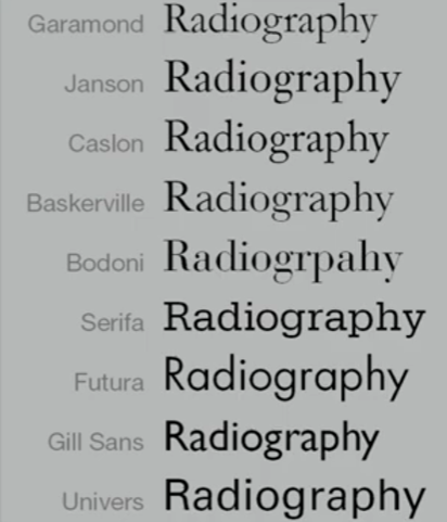
- 10 typefaces represent 500 years of type design. The two goals are easy readability and an appropriate expression of contemporary esthetics
Typefaces - Beyond the gross differences in x-height, the forms display a wealth of variety, in line weight, relative stroke widths and in feeling.
- The Rs display a range of attitudes, some whimsical, some stately, some mechanical, others calligraphic some harmonious and some awkward.Different typefaces 'a' and 'R'


Week 4: Letters / Understanding letterforms

Baskerville 'A'
- Uppercase letter forms suggest symmetry, but in fact is not symmetrical
- Easy to see two different stroke weights of Baskerville stroke form (below); more noteworthy is the fact that each bracket connecting the serif to the stem has a unique arc
Univers 'A' - Uppercase letter forms may appear symmetrical, but a close examination shows that the width of the left slope is thinner than right stroke
- Both Baskerville (not symmetrical letter above) and Univers (letter above) demonstrate the meticulous care a type designer takes to create letterforms that are both internally harmonious and individually expressive
Difference between Helvetica 'a' and Univers 'a' - Complexity of each individual letterform is neatly demonstrated by examining the lowercase 'a' of two seemingly similar sans-serif typefaces - Helvetica and Univers.
- A comparison of how the stems of letterforms finish and how the bowls meet the stems of the letterforms finish and how the bowls meet the stems quickly reveals the palpable difference in character between the two.
Letters / Maintaining x-height
Maintaining x-height between median and baseline - x-height - size of the lowercase letterforms
- Curved strokes, such as in 's', must rise above the median (or sink below the baseline) in order to appear to be the same size as the vertical and horizontal strokes they adjoin
Letters / Form / Counterform - As important as recognizing specific letterforms is developing a sensitivity to the counterform (or counter) - space describes, and often contained, by the strokes of the form.
- When letters are joined to form words, counterform includes the spaces between them
Counterform - Most rewarding way to understand form and counter of a letter is to examine them in close detail
- Examinations also provide a good feel for how the balance between form and counter is achieved and a palpable sense of letterform's unique characteristics.
- Sense of the 'S' holds at each stage of enlargement, while the 'g' tends to loose its identity, as individual elements are examined without the context of the entire letterform.
Details of 's' and 'g'
Letters / Contrast - The following are some examples of contrast-the most powerful dynamic in design-as applied to type, based on a format devised by Rudi ReggContrastTypography in different Medium
Type for print (top) type for screen (bottom) - Typography exists not only on paper but on a multitude of screens. It is subjected to many unknown and fluctuating parameters, such as operating system, system fonts, the device and screen itself, the viewport and more.
Print type VS Screen type
Type for print - Initially, type was designed for reading from print long before we read from screen
- Good typeface for print - Caslon, Garamond, Baskerville (most common typeface used for print as they are elegant and intellectual but also highly readable when set at small font size)
Type for printType for screen
Type for screen - Often modified to enhance readability. For instance, a taller x-height (or reduced ascenders and descenders), wider letterforms, more open counters, heavier thin strokes and serifs, reduced stroke contrast, as well as modified curves and angles for some designs.
- Important adjustment - especially for typefaces intended for smaller sizes- is more open spacing. It is to improve character recognition and overall readability in non-print environment, which can include the web, e-books, e-readers, and mobile devices.
Hyperactive link / hyperlink - Hyperlink - A word, phrase, or image that you can click on to jump to a new document or a new section within the current document
- Text hyperlinks are normally blue and underlined by default
Font size for screen - 16-pixel text on screen is around the same size as text printed in a book or magazine
- As we read books pretty close - they are typically set at about 10 points. If you were to read them at arm's length, you'd want at least 12 points, which is about the same size as 16 pixels on most screens
- 20-24 good point sizes for screen
System fonts for screen / web safe fonts - Open Sans, Lato, Arial, Helvetica, Times New Roman, Times, Courier New, Courier, Verdana, Georgia, Palatino, Garamond
Font size for screen and print
Pixel Differential Between Devices - Screens used by our PCs, tablets, phones and TVs are not only different sizes, but the text you see on-screen differs in proportion too, as they have different sized pixels
- 100 pixels on a laptop is very different from 100 pixels on a big 60* HDTV
Pixel differential between devices
Static VS Motion - Static typography has minimal characteristic in expressing words
- Traditional characteristics such as bold and italic offer only a fraction of the expressive potential of dynamic properties
- Used for posters, billboards, magazines
Static typography - Motion typography - Temporal media offer opportunities to "dramatize" type, for letterforms to become "fluid" and "kinetic" (Woolman and Bellantoni, 1999)
- Film title credits present typographic information over time, often bringing it to life through animation
- Motion graphics, particularly the brand identities of film and television production companies, increasingly contain animated type
- Often overlaid onto music videos and advertisements, often set in motion following the rhythm of a soundtrack


Motion typography (Se7en, opening titles)
INSTRUCTIONS
<iframe src="https://drive.google.com/file/d/1DhIQ-iRuLfKPv1mjtkcrtW81VCBK_dkQ/preview" width="640" height="480" allow="autoplay"></iframe>
Task 1: Exercise 1 - Type Expression
Sketches
Mr. Vinod instructed us to select 4 words to express and create from 7 words suggested by the students in the class. Then, we are told to create rough sketches of our ideas. At first, I thought the word 'dance' as a person dancing as you can see at the top part of the ideas below. Then, after I saw the videos (Typo_Ex_TypeExpressionWords and Typo_Ex TypeExpressionWords II), Mr. Vinod told me to not alter the shape of the words too much. Thus, I tried to not change it by brainstorming more ideas.


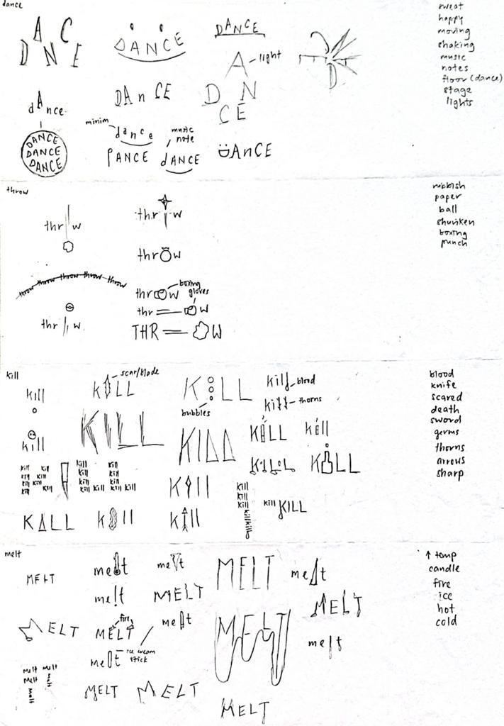


Figure 1.5: Dance with A as light (left) 'Dance' (right) (Week 3, 18/4/23)
However, I don't really like the 'kill' as it doesn't really express how smoking kills people. Therefore, in the second sketch, I chose the idea of kill expressed with a knife with a drop of blood dripping.


Then, I thought of placing the 'r' and 'o' closer to the 'w'. This gives me the feeling of a person walking towards the 'w' (rubbish bin) to throw rubbish. However, I think it shows a person slam dunking too.

On the left below, I used the idea of an ice cream stick with ice cream dripping down. In figure 1.6, I erased the bottom part of the word 'melt'. However, I don't really think that it illustrates the meaning of the word as it kind of disappears.

Figure 1.13: 'melt' (Week 3, 17/4/23)


As I liked the second attempt for animation of 'throw', I decided to change my expression a little to match the animation.


Final Animated Type Expression

Kerning and tracking exercise


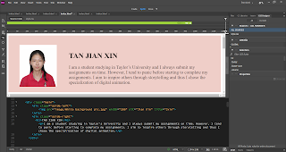
For this exercise, I started by creating margins and columns and pasting the text given by Mr. Vinod. Then, I adjusted the font size to 10pt and leading and paragraph spacing of 12pt. As a result, it gives it a line length of 55-65.


Final Layout
Head
Font:
Janson Text LT Std / 75 Bold (Head) / 56 Italic (Sub head)
Font
size: 30pt (Head) / 20pt (Sub head)
Leading:
24pt
Paragraph
spacing: -
Body
Font:
Janson Text LT Std / 55 Roman
Font
size: 10pt
Leading:
12pt
Paragraph
spacing: 12pt
Characters
per line: 57
Alignment:
Left justified
Margins:
3p top, 6p3 bottom, 3p left and right
Columns:
2
Gutter: 1p5.008
(6mm)

Figure 2.11: Final Layout (without grids) (pdf) (Week 5, 5/2/23)

Figure 2.12: Final Layout (with baseline grids) (pdf) (Week 5, 5/2/23)
FEEDBACK
Week 2
General feedback: Use existing typeface to express word and try to express the word using minimal distortion and graphical elements. Besides, try to use contrast when communicating ideas. Moreover, ensure that the word is readable and keep generating ideas until one point where I either stop or do research. Ask myself the 4 questions provided by Mr. Vinod to improve the expression of the words.
Specific feedback: The word 'kill' can be communicated by hanging the i upside down. Consider where to place the o in 'throw'. Try using capital letters in 'melt' instead of small letters.
Week 3
General feedback: Update work regularly. Make sure to complete Typo_3 and Typo_4. 2 ideas added to the word will confuse people. Keep the space of the artwork in mind.
Specific feedback: Change format of labels. Try to keep things simple within the artwork.
Week 4
General feedback: Pause for about 3 seconds before allowing the animation to loop
Week 5
General feedback: Not advisable to bold the whole body paragraph. Cross alignment increases reading rhythm. Half close eyes and see x-height. Font size smaller than 8pt, reduces readability. Minimum 5mm (gutter). When dealing with capital letters/abbreviation, reduce by 0.5pt (font size). Not good to format a body of text related to each other 2 ways (Ex: centered alignment and left alignment)
Specific feedback: Interesting. pic on top/make it bigger. Unevenness of text (rivers, gutter too big, wider margin). Need to work on kerning and letter spacing.
FURTHER READING

Semantics
The search of the meaning of whatever we have to design. It is important to spend time on the search of accurate and essential meanings, investigate their complexities, learn about their ambiguities, and understand the context of use to better define the parameters within which we will have to operate. Semantics provide the real bases for a correct inception of projects and indicate the most appropriate form for that particular subject. Semantics in design means understanding the subject in all its aspects and relating it to the sender and receiver in such a way that it makes sense to both.
Syntactics
The discipline that controls the proper use of grammar in the construction of phrases and the articulation of a language. In graphic design, syntax is provided by the overall structure, grid, typefaces, text, headlines, illustrations, etc. Grids are one tool used to achieve syntactical consistency.
Pragmatics
The most important details in this text are that it is important to understand the starting point and all assumptions of any project to fully comprehend the final result and measure its efficiency. It is also important to be forceful, intellectually elegant, beyond fashionable modes and temporary fads, and timeless. These values are essential for designing things that will last for a long time.
Chuchnowska, P. (2022) Layout of a Magazine is More Important Than You Think – See Why. Retrieved from <https://www.presspadapp.com/blog/layout-of-magazine/>
Applies to both digital and print magazines
The layout of a magazine is made up of elements such as:
- headline,
- introductory paragraph,
- margins,
- typography (typeface, spacing),
- paragraphs structure,
- indentation,
- color scheme,
- graphic elements,
- initials,
- footers and headers,
- sidebars,
- thickness and color of the frame containing the photo or text
- the number and size of columns,
- placement of intentional whitespace,
- size, position, and number of images and figures,
- size of page margins,
- special effects like overlaying text on an image or rich media,
- chapter or section titles, or headlines and subheads,
- image captions.
- Layout is essential for practicality and consistency, enabling readers to easily navigate information.
- The layout imposes a unique character on the publication and distinguishes it from the others, as well as makes people dive into the next pages with curiosity.
- Layout of a magazine glues all the publication’s individual elements together making a coherent whole.
According to Gestalt psychologists, there are six principles of design:
- figure-ground
- similarity
- proximity
- closure
- continuity
- order
- Helps to focus readers' attention and determine what is key on a given page
- Can be controlled by appropriately selected colors, contrast, and sharpness
- Makes readers aware that particular elements behave consistently (Ex: headers typically use the same font size or color for each issue of a magazine)
- Consistency
- Applies to formatting of blocks of text on the page (If they are far apart, it will be perceived as disconnected paragraphs)
- Arranging elements into a specific shape to group related elements together
- Most frequently used procedure when designing logos, icons, or visual project of magazine titles
- Do not have to be detailed and still remain understandable
- Allows to direct the readers' attention to key information on the page by guiding their eyesight
- Ex: Objects placed close to each other makes the eyes "jump" from one to the other
- If the page layout is not designed harmoniously, a reader simply wastes time trying to understand it, instead of focusing on the written content, ads, or offered functionalities.
- make readers impressed at the very first glance and engage them to start reading
- motivate readers to go through the whole publication with pleasure
- Readability
- Balance (text and image)
- Hierarchy (importance of information)
- Purpose (main goal of layout)
- 90% of information transmitted to the brain is visual, and visuals are processed 60,000 times faster in the brain than text.
- 40% of people will respond better to visual information than plain text.
The New Yorker
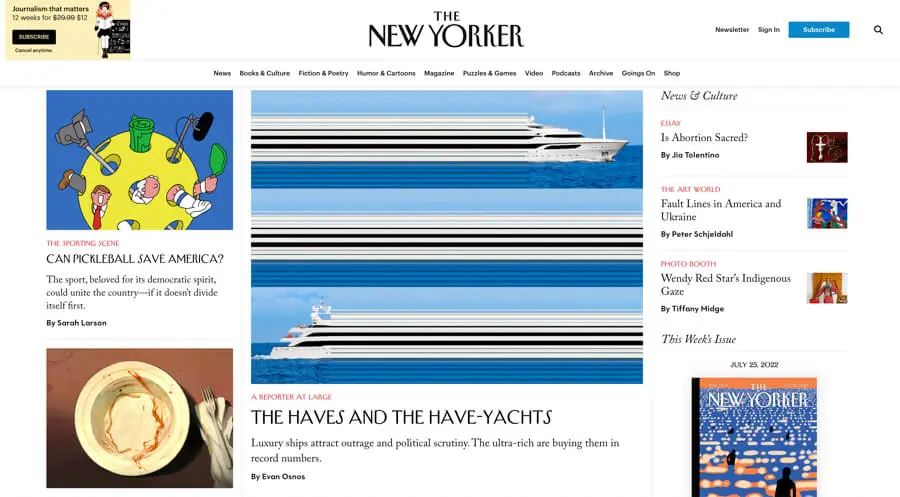
Colors, visuals, and graphics: For both the main page and the tabs, a white background is used, which promotes readability and order. There is actually no play with colors here. Each article has a main cover photo and they are responsible for bringing the color to the whole, as well as photos inside the articles.
Typography: The New Yorker’s typography is consistently maintained throughout the whole site. The article categories are displayed in red, which makes them particularly visible on a white background. The Serif typeface is classic and ensures the text is easy for the readers’ eyes.

Overall impression: The content is pulled to the center of the page, with nothing to distract from the right and left sides. This is where our eyesight goes in the first place. It’s a great example proving that white space is nothing wrong. Everything is organized in a hierarchy – the main article takes the most space. The others are next to or below.
Colors, visuals, and graphics: They pay extra attention to the photography aspect. Besides the quality and magnitude, the visuals tie well with the content that they have and manage to give readers a sense of something. Their pictures are worth a thousand words and always tell their own story.
Typography: There isn’t any fancy typography, however, the white title on a black background at the top of the main website catches the reader’s eye. Two colors dominate the whole layout – white and black – with a touch of yellow.
Food Magazine

Overall impression: The dominance of colors that make up a coherent, matching whole. This project shows that there is nothing wrong with using a colored background, especially if it is filled with soft pastel tones.
Colors, visuals, and graphics: Lots of warm colors (with an orange and celadon domination), and lots of tempting pictures. A first look is enough to know how important the role of the graphic side is here!
Typography: Font color is always different and fitted to the background. They use a few different fonts depending on the usage – magazine title, the title of articles, category, the body of the article, and play with Sans Serif and Serif fonts.

Comments
Post a Comment