Typography Task 2 / Typographic Exploration & Communication
9.5.2023 - 16.5.2023 / Week 6 - Week 7
Tan Jian Xin / 0350784
Typography / Bachelor of Design (Hons) in Creative Media
Task 2 / Typographic Exploration and Communication (Text Formatting and Expression)
List / Jump Link
LECTURES
Refer to Task 1
INSTRUCTIONS
Task 2: Typographic Exploration & Communication (Text Formatting and Expression)
I am required to express typographically the content of "Editorial options" posted in Facebook in a 2-page editorial spread (200mm x 200mm per page). No images are allowed. However, some very minor graphical elements such as line, shade, etc. might be allowed.
Research
After downloading Task 2 (Editorial Text Options), I did some layout research to find a proper layout that enables the readers to easily orientate in large amounts of information.
Figure 1.1: Text layout from Google and Pinterest (Week 5, 3/5/23)
Thumbnail sketch
As I read the third headline, the idea of an eye seems to pop up in my mind. Thus, I decided to select the third text with the headline 'Unite to visualise a better world' and sketched out my ideas. The text states that creative people have been encouraged to use their talents for commercial work, leading to a reductive and harmful code of public discourse. It proposes a reversal of priorities in favour of more useful forms of communication, infotainment and entertainment.
Layouts
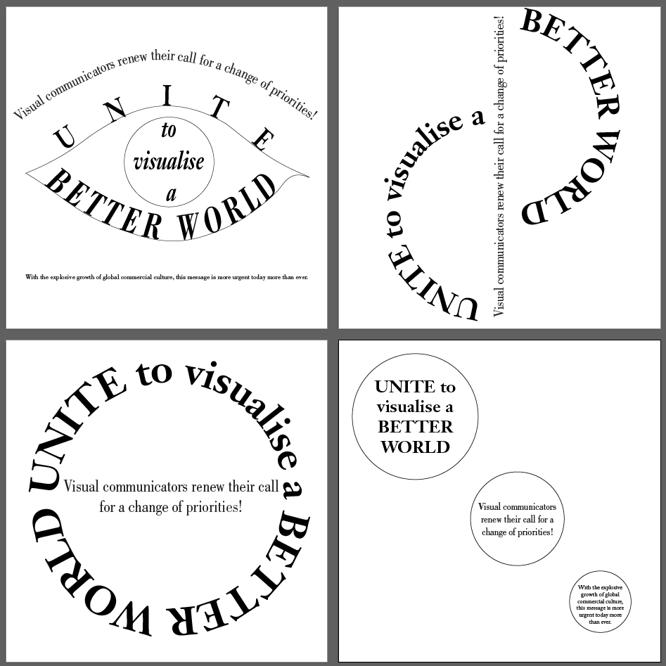
Figure 1.13: Final Layout without grids (pdf) (Week 6, 9/5/23)
.jpg)
Figure 1.14: Final Layout with baseline grids (jpeg) (Week 6, 9/5/23)
As I read the third headline, the idea of an eye seems to pop up in my mind. Thus, I decided to select the third text with the headline 'Unite to visualise a better world' and sketched out my ideas. The text states that creative people have been encouraged to use their talents for commercial work, leading to a reductive and harmful code of public discourse. It proposes a reversal of priorities in favour of more useful forms of communication, infotainment and entertainment.

Figure 1.2: Thumbnail sketches (Week 5, 5/5/23)
Layouts
Figure 1.3: Headline exploration (Week 5, 6/5/23)
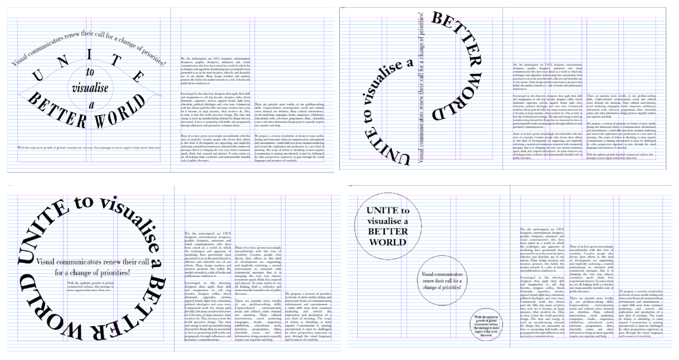 Figure 1.4: Layout exploration (Week 5, 7/5/23)
 Figure 1.5: Layouts covered with patches (Week 5, 7/5/23)
 Figure 1.6: Shortlisted Layout 1 (Week 5, 8/5/23)
 Figure 1.7: Shortlisted Layout 2 (Week 5, 8/5/23)
 Figure 1.8: Headline exploration (2) (Week 6, 9/5/23)
 Figure 1.9: Headline modification (Week 6, 9/5/23)
 Figure 1.10: Process of layout (Week 6, 9/5/23)
 Figure 1.11: Improved layout (Week 6, 9/5/23)
.jpg) Figure 1.12: Final Layout without grids (jpeg) (Week 6, 9/5/23)
Figure 1.12: Final Layout without grids (jpeg) (Week 6, 9/5/23)
After receiving feedbacks from Mr. Vinod, I decided to explore more on the headline that looks like an eye.
After obtaining feedbacks on the headlines, Mr. Vinod told me to keep things simple, as the image shown below with a circle has a larger size than the eye, and has more impact to the readers. As the circle represents a world, it can be displayed as shown on the right, like a camera lens to bring out the word visualise.
Final Layout
Head
Font: Janson Text LT Std / 75 Bold (Head) // Bodoni Std / Book Italic (Sub head)
Font size: 37-97pt (Head) / 26pt (Sub head)
Leading: -
Paragraph spacing: -
Body
Font: Janson Text LT Std / 55 Roman
Font size: 10pt
Leading: 12pt
Paragraph spacing: 12pt
Characters per line: 57
Alignment: Left justified
Margins: 55mm top, 10mm bottom, 12.7mm left and right
Columns: 2
Gutter: 5mm
.jpg)
Figure 1.13: Final Layout without grids (pdf) (Week 6, 9/5/23)
.jpg)
Figure 1.14: Final Layout with baseline grids (jpeg) (Week 6, 9/5/23)
Figure 1.14: Final Layout with baseline grids (pdf) (Week 6, 9/5/23)
FEEDBACKS
Week 6 General Feedback: Layout is not always attractive, but has memorability and effective. Reading is important to understand the text. Form must follow function (significance). Headline expression must have meaning. Graphical element shouldn't be too extensive that takes more attention than body text. Body text should maintain line length to communicate that body text is related. Short line length can cause rivers. People are going to judge at fraction of seconds (face value). Focus on one thing rather than both (Expression and layout). Specific Feedback: People are going to read what is on top instinctively. No connectivity between body text and headline expression. Should not use bodoni for body text.
Week 7 General Feedback: Ensure that all final submissions has jpeg and pdf. Check visibility of pdf through incognito mode taught in week 1.
REFLECTIONS
Experience
I think this task is quite challenging as we have lesser time compared to Task 1. Although I tried to create different headline expressions, not every one of it has a meaning. On the other hand, reading the body text is also important to introduce continuity between the headline and the body text. Moreover, I also realized that it's always good to keep things simple. As I was very absorbed in the headline expression that looks like an eye, I never thought of keeping things simple as I did in my third layout. Besides, I also try to apply what I learnt through the previous task of reducing the font size by 0.5 for the capital letters UIUX.
Observation
I can see that I have a lot to learn from my peers as their ideas and layouts are interesting. For instance, I learnt that we have to maintain the line length for the body text to convey that the body text is related to each other. I also realized that I unintentionally imitated my layout research which cuts the circle in half as it attracts my attention.
Findings
As Mr. Vinod says, "Form must follow function", the headline expression must have some meaning to it. As I found out that the expression to a headline has meanings behind it, it does not just to attract readers to read the text. For example, if a dot at the bottom right balances the whole layout, it has significance. Besides, every people will have different judgement on our layouts in just a fraction of seconds (face value). Thus, we have to make something impactful and memorable enough to attract the readers and convey the message of the headline.
FURTHER READINGS
Figure 1.15: Cover page of 'Designing with type: The Essential Guide to Typography' by James Craig
I read about type measurements as Mr. Vinod didn't emphasize on the details in class. There's 2 basic units: points and picas.
Points: Very small units used to measure type size and size of space between lines of type
Picas: Larger compared to points, used to measure length of a line of type.
1 Pica = 12 Points
Points: Very small units used to measure type size and size of space between lines of type
Picas: Larger compared to points, used to measure length of a line of type.
1 Pica = 12 Points

Figure 1.16: Page 46 of 'Designing with type: The Essential Guide to Typography'
Each letter has their own amount of space. A wider character has a larger set-width.

Figure 1.17: Example of set-width (Page 48)
I also read on designing with text type. (Pg 100)
- The more distinct the outline, the more easily the eye recognizes the words
- The type should not intrude the reader and the thought expressed on the printed page

Figure 1.18: Lowercase letters are more recognizable than all caps (Page 102)
Characteristics of typefaces
Common
- Variation in stress
- Variation in strokes
- Variation in serifs

Figure 1.19: Diagonal stress (Page 60)
Variation in strokes
- Degree of contrast between thick and thin part of letter
- Ex: Modern typefaces (Bodoni) present maximum contrast between thick and thin stroke
- Helvetica has an absence of noticeable variation (constant strokes)
Variation in serifs
- Vary in weight and bracketing
- Century Expanded showed a return of use of heavy serifs
- Helvetica and other trend setting sans serif typefaces of twentieth century eliminated serifs altogether


Comments
Post a Comment