Interactive Design Lectures
28.8.2023 - 3.10.2023 / Week 1 - Week 6
Tan Jian Xin / 0350784
Interactive Design / Bachelor of Design (Hons) in Creative Media
Lectures
Week 1
Briefing on Module Information Booklet (MIB)
Week 2: Usability: Designing Products for User Satisfaction
What is usability?
- Usability refers to how effectively, efficiently, and successfully a particular user can utilise a product or design in a certain situation.
- An interface with high usability guides users through its easiest route to achieve its goal
Consistency
Simplicity
Visibility
Feedback
Error Prevention

Complex interfaces
Confusing navigation
Poor feedback
Inadequate error handling
Importance of website structure
- Find information easily
- Affects SEO (search engine optimization)
Website key elements
- Header (website's logo (left), navigation menu (don't hide), and contact information (not necessary))
- Body (text, images, videos, other multimedia elements (interactivity, sound, animation...), information hierarchy)
- Footer (Copyright information (credibility), links to important pages, contact details)
Organizing Content
- Use headings (H1, H2, H3 to create a hierarchical structure)
- Prucode (quotations)
Navigation Menus
- Help users move around the website
- Clear and concise labels (Consider using dropdown menus for complex sites.) Anatomy of landing page
 Figure 2.1: Anatomy of landing page
Week 4: Web Standards
How the web works
To find the location of the web server, your browser will first connect to a Domain Name System (DNS) server
1. When you connect to the web, you do so via an ISP. You type a domain name or web address into your browser to visit a site
2. Your computer contacts a network of servers called DNS servers. These act like phone book; they tell your computer the IP address associated with the requested domain name. Every device on the web has a unique IP address; it's like the telephone number for the computer
3. The unique number that the DNS server returns to your computer allows your browser to contact the web server that hosts the website you requested. A web server is a computer that is constantly connected to the web, and is set up especially to send web pages to users
4. The web server then sends the page you requested back to your web browser
Structure of web page
- Understanding structure
- Learning about markup
- Tags and elements
Page structure


Figure 3.1: Page structure (microsoft word-left) (web page-right)
HTML - Hypertext MarkUp Language
CSS - Cascading Style Sheets


Figure 3.2: Opening tag and closing tag
Attributes (tell us more about elements)
- Used to emphasize certain words
<i> & </i> (italic)
- Used for technical terms, names of ships, foreign words, thoughts, unique words
List
Ordered / numbered
- <ol>
- <li> & </li>

Unordered / bullet points
- <ul>
- <li> & </li>

Nested list / sub-list
<li>

Links
<a> & </a>

Figure 3.9: link properties
Adding image
<img>

Figure 3.10: image HTML link
Save main file name as - index.html (no uppercase)
Sub folder - images (jpeg/png/gif)
Week 5: HTML & CSS
ID attribute
- Can only apply 1 HTML element using same value (No 2 elements have same value for ID attribute)
- Can add to link different section in HTML
- Unique
Class attribute
- More than 2 HTML element can have the same value / name (same font size, typeface....)
- Important when building layout (ID attribute and class attribute)
Structure of web page
- Understanding structure
- Learning about markup
- Tags and elements
Page structure
HTML describes structure of pages (Ex: <element>Information</element>)
CSS - Cascading Style Sheets

Figure 3.2: Opening tag and closing tag
Need to add space for more than one attribute.
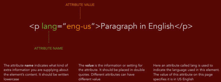
Figure 3.3: Example of attribute
Headings
Has 6 levels of headings
- <h1> main headings
- <h2> subheadings
- <h3> until <h6> if necessary
- No <h7>
Figure 3.4: Headings in html and result
Paragraph
<p> & </p>
- Paragraph spacing

Figure 3.5: Paragraph in html and result
Bold and Italic
<b> & </b> (bold)Figure 3.3: Example of attribute
Headings
Has 6 levels of headings
- <h1> main headings
- <h2> subheadings
- <h3> until <h6> if necessary
- No <h7>
Figure 3.4: Headings in html and result
Paragraph
<p> & </p>
- Paragraph spacing
Figure 3.5: Paragraph in html and result
Bold and Italic
- Used to emphasize certain words
<i> & </i> (italic)
- Used for technical terms, names of ships, foreign words, thoughts, unique words
Ordered / numbered
- <ol>
- <li> & </li>
Figure 3.6: Ordered list in html and result
- <ul>
- <li> & </li>
Figure 3.7: Unordered list in html and result
<li>
Figure 3.8: Nested list in html and result
<a> & </a>
Figure 3.9: link properties
Adding image
<img>
Figure 3.10: image HTML link
Sub folder - images (jpeg/png/gif)
Week 5: HTML & CSS
ID attribute
- Can only apply 1 HTML element using same value (No 2 elements have same value for ID attribute)
- Can add to link different section in HTML
- Unique
Class attribute
- More than 2 HTML element can have the same value / name (same font size, typeface....)
- Important when building layout (ID attribute and class attribute)
- Not unique
Block element
- Display top to bottom (New elements in HTML starting on a new line)
- Some elements will always appear to start on a new line in the browser window
- Ex: <h1>, <p>, <ul> and <li> (not <a> & <img>)
Inline elements
- Continue within the same line
- Some elements will always appear to continue on the same line as their neighboring elements
- Ex: <b>, <i>, <em>, <a> and <img>
- <strong> = <b>, <em> = <i>
Cascading Style Sheet (CSS) (changing appearance)
- Allows you to create rules that specify how the content of an element should appear
- Ex: Background image, color, font size, color, display from inline to block level and vice versa)
- Different from HTML
- Two parts: a selector (HTML tag) and a declaration (2 other parts)
- Paragraph, ID attribute, class attribute

Figure 4.1: CSS
- Headings of same style, color (can group in style declaration)
.png)
Figure 4.2: Grouping style declaration

Figure 4.3: Before shorthand

Figure 4.4: Shorthand
Headings
- Don't reduce font size
- Can increase
Week 6: Display CSS
CSS Selectors
- Selectors are used to define which elements should receive specific styes, such as colors, fonts, spacing,...
Universal selector
- Selects all elements on page.
- Represented by an asterisk, *

Figure 5.1: Universal selector
Element selector
- Simplest type of selector
- Targets HTML elements by their tag name

Figure 5.2: Element selector
ID selector
- Targets an element with a specific ID attribute
- To select an element with a specific ID, use the # symbol followed by the ID name

Figure 5.3: ID selector
Class selector
- Targets elements with class attribute
- To select an element with a specific class, use the . symbol followed by the class name

Descendant selector
- Selects an element that is a descendant of another element. Can specify hierarchy of elements to target.
- Ex: to style all <a> elements inside a <div> with class "container"

Child selector
- Selects elements that are direct children of another element
- To select only the immediate <li> children of an <ul>

Pseudo-class selector
- Selects elements based on their state or position in relation to other elements
- Common pseudo-classes include :hover, :active, :active, :focus, and :nth-child(n)

Pseudo-element selector
- Selects parts of an element rather than the element itself
- Common pseudo-elements include ::before and ::after

Reasons for so many selectors
- CSS provides a variety of selectors to offer flexibility and granularity when targeting HTML elements for styling.
- Give web developers the ability to precisely target and style specific elements or groups of elements based on their structure, attributes, state, or position within the document.
- Pseudo-classes and pseudo-elements, responsive design, stateful interactions, cross-browser compatibility, ease of maintenance, accessibility
Structure
Attribute-based selection
- Attribute selectors like [attribute="value"] allow you to style elements based on their attributes or attribute values.
Pseudo-Classes and Pseudo-Elements
Stateful Interactions
Block element
- Display top to bottom (New elements in HTML starting on a new line)
- Some elements will always appear to start on a new line in the browser window
- Ex: <h1>, <p>, <ul> and <li> (not <a> & <img>)
Inline elements
- Continue within the same line
- Some elements will always appear to continue on the same line as their neighboring elements
- Ex: <b>, <i>, <em>, <a> and <img>
- <strong> = <b>, <em> = <i>
Cascading Style Sheet (CSS) (changing appearance)
- Allows you to create rules that specify how the content of an element should appear
- Ex: Background image, color, font size, color, display from inline to block level and vice versa)
- Different from HTML
- Two parts: a selector (HTML tag) and a declaration (2 other parts)
- Paragraph, ID attribute, class attribute

Figure 4.1: CSS
.png)
Figure 4.2: Grouping style declaration
Method to employ CSS
External CSS
- Separate document
- Use one CSS to control presentation (fonts and colors) and a second to control layout
- Ex: <link>
Internal CSS
- Same document
- Ex: <style>
External CSS
- Separate document
- Use one CSS to control presentation (fonts and colors) and a second to control layout
- Ex: <link>
Internal CSS
- Same document
- Ex: <style>
Background
Shorthand (cannot include background size)
Shorthand (cannot include background size)

Figure 4.3: Before shorthand

Figure 4.4: Shorthand
Word-spacing units: px / pt
Color code for css:
- light purple: properties
- orange: values
- colons/semicolons: black
- class attributes: green
Class attribute
- no numbers
- no space (If space = 2 values)
- use - or _
Color code for css:
- light purple: properties
- orange: values
- colons/semicolons: black
- class attributes: green
Class attribute
- no numbers
- no space (If space = 2 values)
- use - or _
Headings
- Don't reduce font size
- Can increase
Week 6: Display CSS
CSS Selectors
- Selectors are used to define which elements should receive specific styes, such as colors, fonts, spacing,...
Universal selector
- Selects all elements on page.
- Represented by an asterisk, *
Figure 5.1: Universal selector
Element selector
- Simplest type of selector
- Targets HTML elements by their tag name
Figure 5.2: Element selector
- Targets an element with a specific ID attribute
- To select an element with a specific ID, use the # symbol followed by the ID name
Figure 5.3: ID selector
- Targets elements with class attribute
- To select an element with a specific class, use the . symbol followed by the class name
Figure 5.4: Class selector
Descendant selector
- Selects an element that is a descendant of another element. Can specify hierarchy of elements to target.
- Ex: to style all <a> elements inside a <div> with class "container"
Figure 5.5: Descendant selector
Child selector
- Selects elements that are direct children of another element
- To select only the immediate <li> children of an <ul>
Figure 5.6: Child selector
Pseudo-class selector
- Selects elements based on their state or position in relation to other elements
- Common pseudo-classes include :hover, :active, :active, :focus, and :nth-child(n)
Figure 5.7: Pseudo-class selector
Pseudo-element selector
- Selects parts of an element rather than the element itself
- Common pseudo-elements include ::before and ::after
Figure 5.8: Pseudo-element selector
Reasons for so many selectors
- CSS provides a variety of selectors to offer flexibility and granularity when targeting HTML elements for styling.
- Give web developers the ability to precisely target and style specific elements or groups of elements based on their structure, attributes, state, or position within the document.
- Pseudo-classes and pseudo-elements, responsive design, stateful interactions, cross-browser compatibility, ease of maintenance, accessibility
Structure
- Selectors like descendant selectors (parent element > child element) and sibling selectors (element + adjacent element) enable you to target elements within specific structural contexts.
Attribute-based selection
- Attribute selectors like [attribute="value"] allow you to style elements based on their attributes or attribute values.
Pseudo-Classes and Pseudo-Elements
- Ex: you can style links differently when they are hovered over (:hover) or style the first letter of a paragraph (::first-letter//::first-line) differently.
Responsive Design
Responsive Design
- Media queries, a type of selector, enable you to apply different styles to elements based on the user's device characteristics, such as screen size, orientation, or resolution.
Stateful Interactions
- Selectors like :focus, :active, and :checked allow you to style elements based on user interactions.
- Ex: you can style a button differently when it's clicked (:active) or style form elements when they are in focus (:focus).
btn=button, img=image
Week 7
Display property - Used to create layout (Most elements is usually block or inline)
Block-level element
- <div>, <h1> until <h6>, <p>

Figure 6.1: Block element
Inline element
- <span>, <a>, <img>, <i>, <b>, <strong>, <u>

Figure 6.2: Inline element
Box model
In CSS
- Most HTML elements are containers (Ex: Body, p, h1, h2, div, ul, ol, li)
- Padding, border, margin
- Size of each layers can be specified using units of em, %, and px
- Not advisable to use px (think of mobile first-think of smaller sizes first)

Figure 6.3: Layers in box model
To create responsive document insert:
<meta name="viewport" content="width=device-width, initial-scale=1.0">
A body contains small spaces of margin
Week 7
Display property - Used to create layout (Most elements is usually block or inline)
Block-level element
- <div>, <h1> until <h6>, <p>
Figure 6.1: Block element
Inline element
- <span>, <a>, <img>, <i>, <b>, <strong>, <u>
Figure 6.2: Inline element
Box model
In CSS
- Most HTML elements are containers (Ex: Body, p, h1, h2, div, ul, ol, li)
- Padding, border, margin
- Size of each layers can be specified using units of em, %, and px
- Not advisable to use px (think of mobile first-think of smaller sizes first)
Figure 6.3: Layers in box model
To create responsive document insert:
<meta name="viewport" content="width=device-width, initial-scale=1.0">
A body contains small spaces of margin
Ex: body {
padding: 0;
margin: 0
}
Width have to use unit of %
Comparison of without padding and with padding


Flex layout

Figure 6.5: Flex layout
Pseudo-class selector (order)
1. a:link
2. a:active (if you click)
3. a:hover (when you hover the mouse)
4. a:visited (when u clicked the link, then you come back)
Week 8 - Independent learning week
Week 9
Static are positioned according to the normal document flow.
- This is the default view, and elements are not affected by top, right, bottom, or left properties.
- Ex:
.static {
Width have to use unit of %
Comparison of without padding and with padding
Figure 6.4: Difference of without padding (left) and with padding (right)
Flex layout
Figure 6.5: Flex layout
Pseudo-class selector (order)
1. a:link
2. a:active (if you click)
3. a:hover (when you hover the mouse)
4. a:visited (when u clicked the link, then you come back)
Week 8 - Independent learning week
Week 9
Static are positioned according to the normal document flow.
- This is the default view, and elements are not affected by top, right, bottom, or left properties.
- Ex:
.static {
background-color: aquamarine;
position: static;
top:0;
right:40px;
width: 50%;
}
Relative are positioned relative to their normal position in the document flow.
- You can use top, right, bottom, and left properties to move the element from its normal position without affecting the layout of other elements.
- Ex:
.relative {
background-color: aqua;
position: relative;
top: 0;
right: 0;
}
Absolute are removed from the normal document flow and are positioned relative to their nearest positioned ancestor (an element with a position value other than static) or the initial containing block (the viewport if no positioned ancestor is found).
- Using top, right, bottom, and left properties, you can precisely control the element's position.
- Ex:
.absolute {
background-color: blue;
position: absolute;
top:0;
right: 0;
width: 100%;
height: 100%;
z-index:0;
}
Fixed are also removed from the normal document flow but are positioned relative to the viewport, meaning they stay in the same position even when the page is scrolled.
- You can use top, right, bottom, and left properties to set the element's position on the screen.
- (only take up the size of the content/text)
- Ex:
.fixed {
background-color: brown;
position: fixed;
right: 2%;
bottom: 0;
box-sizing: border-box;
}
Sticky are positioned based on the user's scroll position and the normal flow of the document.
- They behave like relative until they reach a specified offset position (E.g., top: 20px), after which they become fixed until the user scrolls back.
- Ex:
.sticky {
background-color: cadetblue;
position: sticky;
}
Notes:
- relative and static almost the same
- fixed and absolute almost the same
- when using positions stated above, it's important to specify at least one of the positioning properties (top, right, bottom, or left) to determine the exact position.
- regardless of how large the device is, 100vh=whole device
- smallest value of z-index: -1
- largest value for z-index: 1000
- z-index doesn't have units such as px or %
- use em as value to increase responsibility
Week 10
Adding box-sizing: border-box; is to ensure the contents doesn't go beyond the box.
Second way to change fonts in CSS is shown below

Figure 7.1:Pasting font in CSS
- when using positions stated above, it's important to specify at least one of the positioning properties (top, right, bottom, or left) to determine the exact position.
- regardless of how large the device is, 100vh=whole device
- smallest value of z-index: -1
- largest value for z-index: 1000
- z-index doesn't have units such as px or %
- use em as value to increase responsibility
Week 10
Adding box-sizing: border-box; is to ensure the contents doesn't go beyond the box.
Second way to change fonts in CSS is shown below
Figure 7.1:Pasting font in CSS
Comments
Post a Comment